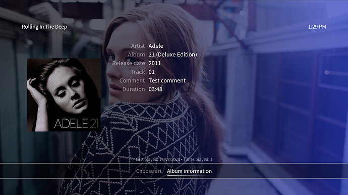
I’m a recent purchaser of the 4K and I love everything about it. It has relieved most of my general computer frustration. Thank you! Now my request: is there any way to alter OSMC so that when playing music and pushing the info button on the remote, the “comment” tag can be displayed. Right now there is artist, title, album etc which is great, but “length” seems way less important than all the info I have stored in my comment tags. I have the names of the performers and recording dates etc. Is there an easy way to do this?
Hi,
Do you know which skin you are using?
Sam
Whatever the default is. I haven’t attempted to change anything because it looks great and works so well.
I have moved your thread and edited the title to make it reflect the request. I would assume your using the OSMC skin as the only skin that is installed by default (Estuary) shows this information when you bring up the info dialog from a file view. This would be a question for our skinner @Chillbo.
Thanks very much. I know many music fans will be pleased by this if it happens!
Problem is… Which information to show, if we show more than the basic one? Comments is one tag, but there are so many more that could be shown. I’m not sure how to decide this the best way. Any ideas from the team maybe? 
What is really needed is an info page that is configurable, so you choose what metadata you want to display. This would rock everyone’s world!
I think Estuary’s handling of it makes sense. Info overlay from fullscreen playback does not show it, but from the file or playlist view the info from a song brings up the comment tag as the main media element. This makes sense to me as if you do the same over an album that media element location gives you the album summary/review, or over an artist, it gives the artist summary/review. As there is no similar summary/review from the scraper for individual songs, using the comment tag seems to be the closest analog.
I’m not sure is the OP here is asking for this info to be on full screen playback. Personally I think that overlay should be kept as minimal as possible as it currently is.
There’s a point there. I can see whether I can add the comment field to the song info dialog. There’s currently no text field present for individual songs.
Concerning a comment field in the fullscreen music playback window I tend to agree with @darwindesign: it should stay minimal. Additional, extended information are to be found in the info dialogs for all types of media that are stored in the library.
Actually, I have to correct one thing here: the song info dialog does very well have a text field atm which is populated with the ContributorAndRole infolabel. I’ll add the comment infolabel as another information label in the list of other song details in the song info dialog:
I’ve now pushed the changes with this commit: https://github.com/Ch1llb0/skin.osmc/commit/094364a71725af3c4f036c6cddb1b633b6b35d54
This is fantastic! Thanks to you and all the developers for your attention to this. In my case my happiness using OSMC has increased even more!
