My impression is that it is darker on some pages, and some have the old light color for example in the My OSMC page
Pi config does not show MPG2 or WVC1 enabled any more.
_ Tv channels take a lot more time to show up.
On TV channels menu using the right arrow to select sub menu ( to choose all channels for example) will give transparent underground, so the menu text is not readable.
-If you go to Settings > System info > Hardware … the last line is overlapping with the information (in yellow text) at the bottom of the screen.
The power menu is now screen wide and with almost black underground. I liked the old one better.
Thank you for all the hard work.
this exact same thing happened to me when the new skin was first released for testing a couple of weeks ago.
A bug that seems has not been addressed before being pushed out to everybody.
For me the new skin is way too dark. How can I enable movies/series descriptions? For now I have only movie info symbols which are ugly and doesn’t match rest of the new skin.
I’m new in this forum and I would like to start by saying thank you for the incredible work you put into this HTPC software.
I’m currently running the last osmc release on a Raspberry Pi B+ first generation and I’m very impressed about how it works !
I create an account to give a feedback about the last update changing the osmc theme.
There is in this last update good things and (for me at least) bad things.
Bad :
I don’t like the new dark look of osmc. It was better before. It true than I was difficult to see the current selection but it’s still the case and it not better looking.
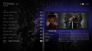
When a film is selected I can see is Name/Year/Type and Cover but not the short summary. The summary as been replace by technical information I don’t care about those information in middle of my screen (no option found to remove it). My movie is how it is I’m not gonna select my movie because it’s DTS or not.
The same with the summary appearing with the overlay if I want to go forward or backward. I already choose my movie I don’t want to see this anymore.
I prefer the old power window
Also I loved having the Cover and the background image when I select a movie but the background image is gone now.
Good :
Everything else
I know it sound like everything is a regression but it’s how I feel about the update.
I’m open to criticism about my post.
Sorry if my english is not perfect, I know it’s not !
I hope if there is a lot of people thinking the same you will make some change to please the biggest number !
It would be nice to just have the choose of those change in the options.
I like to make a suggestion concerning the skins.
May be it is a good idea to have two skins of OSMC to choose from. The old one with light colour and the new one with dark colour. In this way we can continue testing the skins, and if something gets wrong you can fall back to the skin which gives you the most stability.
Overall I really like the new skin – I love the child friendly icon grid view for movies
1 big rub – the font size is Very small on my 42” TV 20’ back from the wall. The old font size was JUST visible.
How can we override the font size to a MUCH larger size.
I have a simplified GUI setup:
Movies
Child (file view)
Comedy (file view)
Fantasy (file view)
Superheroes (file view)
etc (file view)
Videos
- Tv Series (file view)
- USTVnow
- Ted Talks
- Music Videos (file view)
Music
- My Music(file view)
- Pandora
Maint
-My OSMC
- Power
-All other Maint type items
For me the skin in general is a step in the wrong direction. Not minding the purely subjective (i.e. is this more beautiful than the old skin, which in my opinion it isn’t) but usability-wise I find the new skin almost unusable, it seems less polished than the old version.
I know that Hitcher (at least previously) worked on this skin, he’s now focusing on a skin called ftv, in my opinion something based off of that would be sooooooo much better, maybe with an OSMC-blue twist Might be a bit on the heavy side for rpi1 though (offer both skins!)
Well anyway, if you like me prefer the old skin, here it is (it won’t replace the current skin but will be added as another skin called osmc-legacy,) btw haven’t tried installing the zip so dunno if the structure is correct or not. If not just unzip and ssh it to your add ons folder: Dropbox - File Deleted
BTW, if you use this older “legacy” skin, then be aware that it is no longer supported by anyone involved with OSMC.
With that in mind, it would be best to message hsus directly for support.
If you encounter an error, then message hsus directly to get a fix. Also, if you want to make small suggestions for changes to the hsus’ legacy skin then, again, message hsus directly.
Hi,
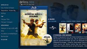
To have this back ground you just need to activate the fan art in the left window (where you can search for a movie, choose the layout …).
I took this picture on google. and if you want on the confluence skin you can have this type of view, with all information.
I like the new look that takes advantage of the larger screen space, and Im sure I will get used to the darker shade. Its also nice to see the selections standing out more, and the fan art in the background now looks amazing!
Only issues I found was that the OzWeather App now doesnt work at all for me (I had to swap to Yahoo Weather for it to show up) and I am now missing the descriptions from below the Movie/TV Show/Episode (which I thought were a better idea than the tech info.
Can I ask, is there still going to be an implementation of of the RSS feed into the skin some day? I would like to add feeds for news and current affairs.
As always, AMAZING WORK and thank you to all involved!
Any chance of adding plot preview (in video addon section) for movies & tv shows? Other than that, the user customizations are great. Highly customizable skin is what I like & prefer. It allows the user to truly make it their own. Great work devs!
Thanks for the hard work, I like the new look, especially the new movie layouts !
If I may suggest an improvement, I find the subtibles screen (the menu where you select the subtitle file to download within lists for each provider service) a little annoying :
The files names are truncated, which makes it quite difficult to find the correct one. Would it be possible to either decrease the font size on that menu or auto-scroll on the file names ?