Thanks for the update! As most people said the dark background and the yellow highlight do not look that great.
Also, under Video Calibration the arrows are not visible after you made the background black. I noticed that a lot of the logos do not look good since they have transparent background and you made the background black.
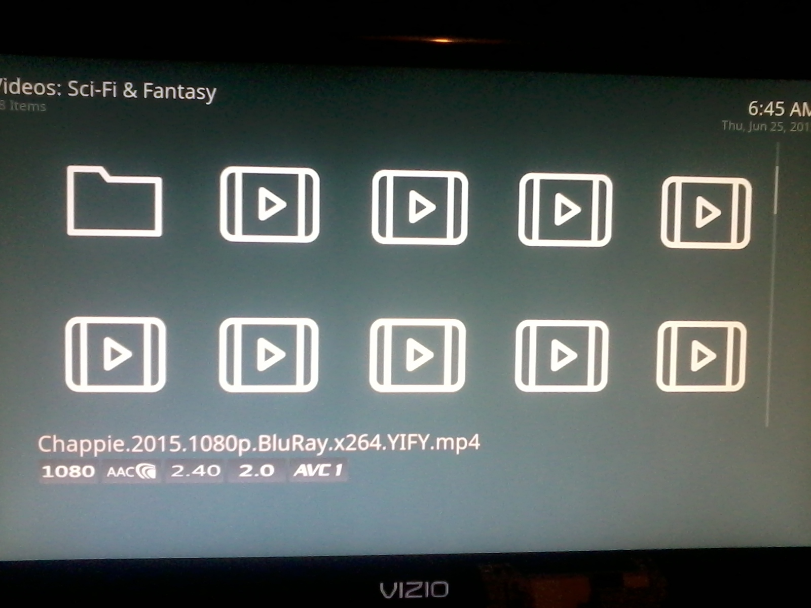
The highlight is a little hard to see on this new version. It’s like an off white-ish color when selecting items and it’s a little difficult to see over the white. I couldn’t really notice it unless I was moving around between files. Here’s a pic. Chappie is the item selected in the middle of the second row. (Don’t worry I saw Chappie in the cinema twice and own it on BluRay and on PS4)
Can you start a new thread for the technical, non-skin related problems you’re experiencing (such as the problem you describe with 1080p video) with as much detail as you can about the problems as we will do our best to help you with them - this skin thread is not the place for that.
I’m more about the visual aesthetic. The skin feels too…empty. And I have horrible eyesight, also like people have already mentioned text is too small on big tvs. I’m hoping thumbnail view will come to OSMC at some point.
When playing video you can back out to browse through folders, adjust settings, go to the home screen, etc, and video will continue to play in background. Raspbmc did this too. I just now realized what that option was for while watching a video and going back to the containing folder to check if I had subs for it.
Though, unless you have a Pi 2, the performance of this feature is quite low. It is quite resource intensive on 512mb pi’s and particularly the original 256mb B models…
I haven’t noticed any low performance on B+. Streaming or playing local files. I haven’t overclocked or anything either. Seems to work just fine for me.
really great that OSMC is now stable but I think the new look is a step backwards. I liked the previous simplistic look with the fonts etc, the new main menu looks kinda cheap and less slick. The icons showing the file attributes are hideous and blurry and completely spoil the look, its that sort of thing that drove me away from XBMC, surely if you wanted to know that info you could check it via the menu or something.
I haven’t been using my Vero much lately as I have moved to the other side of the world, so I’m having trouble remembering the other things i liked about the other skin but overall i think it was much better.
Chiming in with similar comments - I preferred the lighter background and the previous font (though I’m getting used to the new ones). Would really really like to see a plot summary option back - the icons are ugly and useless to me. Even though the plot summary was sometimes cut off due to space it still makes it much easier to recognise an episode of a TV show for example.
In terms of the visual aspect i’m afraid you guys took a step into the wrong direction
I liked the text bigger like it was etc but the worst change was the background.
Please bring back the old background, that really, really, REALLY nice color with a smooth radial gradient, pleeeeeeease it was so much better than this flat dark color i dont even know why you would preffer this new backgroung, performance? Im sure everybody here preffers the old one.
At least can you guys make it a skin option for the background, where you choose the flat color or the nice gradient. Please?
I keep thinking on downgrading to RC2, or install the old skin but for the other hand i want to have the latest version. Please consider this. Thank you for all your hard work i love OSMC!!!
I think you should get rid of the summary box when you pause the video. If you want to download subtitles, that box gets in the way, blocking some of the view.