Bring back the original skin/theme, and make it an option, instead of forcing a new skin/theme on us.
Which skin are you referring to?
Confluence, the former default Kodi skin can be installed from the repository
Estuary, the new default Kodi skin can be selected from Settings -> Appearance.
The OSMC skin has been updated so that it runs with the new version of Kodi. The old version won’t be coming back unless anyone wants to step up and bring it up so that it’s supported by Krypton.
No one forced a new skin on you, and you are free to install an older version of OSMC or use a different skin. Assuming you mean OSMC skin, we provided designs and information about the new skin in the last eleven months of blog posts, asking users for feedback. This has not been a lightly made or impulsive decision on our part.
Without knowing which skin you are referring to it’s hard to address your complaints.
I am referring to the default light blue background with OSMC written at the top, and vertical list, instead of thumbnail. Not Confluence, or Estuary.
That’s not coming back.
Unfortunately we just don’t have the resources (the people who developed it are gone) to support that skin. We struggled to support it for Jarvis (it was incomplete and buggy). If someone wants to bring it up for Krypton we would add it to our repository, but I suspect that’s unlikely.
We’re happy to accommodate feature requests for the new skin however.
Buggy? It worked perfectly, and was simple, and easy on the eyes. Estuary is close, but does not fit my screen properly, the text hangs over the edges, but all other skins seem to fit perfectly.
- It was broken for PVR
- It was broken for several views
- It was incompatible with the upcoming Kodi Krypton
- Icons were missing
- The highlight colour received many complaints
I can go on.
As a result, we started fresh, with our designer and a new skinner to work on something different. The first mention of development was in March 2016, so the new skin and our plans to deprecate the old are (hopefully) not a surprise.
Select Just Scan or 1.1 pixel mapping on your TV.
i second this request. Some gofundme to bring this skin back?
I regret the change of background - it looks to me as if the blowup of a piece of hairy skin was used.
I have, therefore, reverted to confluence, which I found more pleasing to my eyes.
I can blame only myself for not watching what the proposed new skins were.
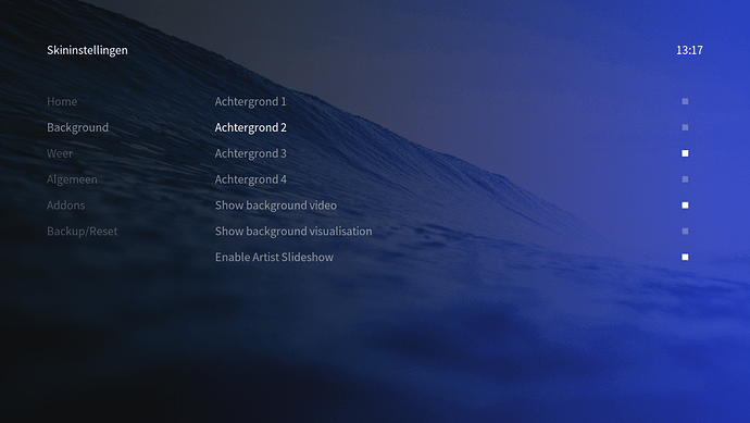
I think the new skin is superb, but if I could change one thing, the white versus slightly alpha white is still very difficult to distinguish in some screens.
Couple of examples:
- The left-hand menu on screens like Main » Settings » Interface » Skin » Configure Skin
- The blue pop up menu on screens like Main » Power
- The horizontal list on ‘Information’ screens.
I’d be more than happy to help fix this with a point in the right direction?
P.S. I’d also love to be able to choose a custom colour in place of the default bright blue.
