Opening a new topic since the other one is now automatically closed.
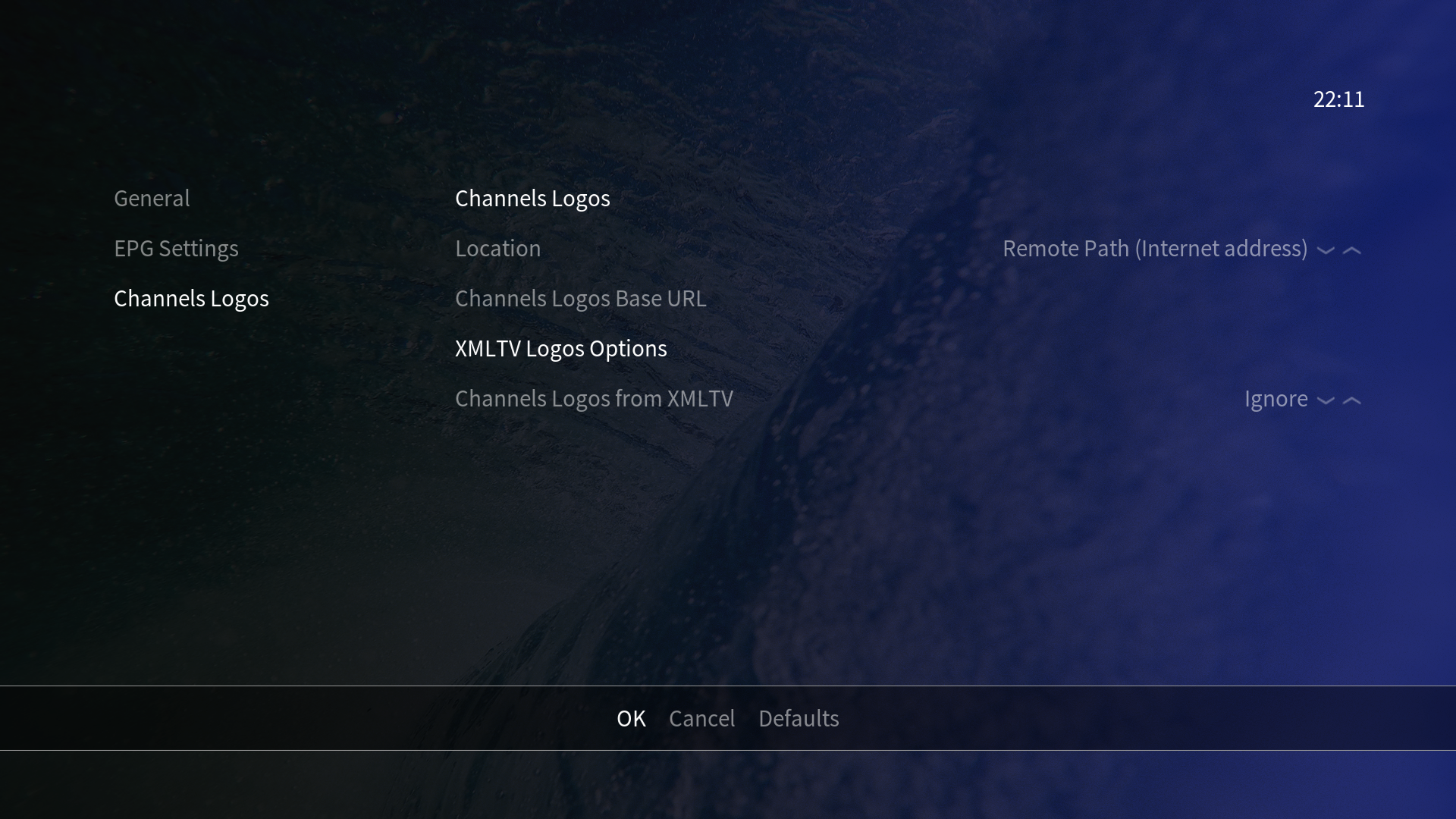
When I use my TV with the “TV Mode” activated (which is basically a preset of colors, contrast, brightness, etc on a Philips 50") I can’t seem to distinguish greyed menu options from selected ones. But if I change it to “Computer Mode”, where the colors all become washed out and lose all the vividness I can see it fine.
Which means that it works but would it be possible to add a bold to the selections? This would be the best of both worlds. Keeping the grey to the ones who see it and adding another visual aid to the ones that hardly do.
(Yet, I’m not sure if it’s widespread or if it’s just me and my TV.)
Computer Mode is changing the gamut range. I have found that on an LG TV in the past, and annoyingly only under certain refresh rates. Check your settings and it may be adjustable.
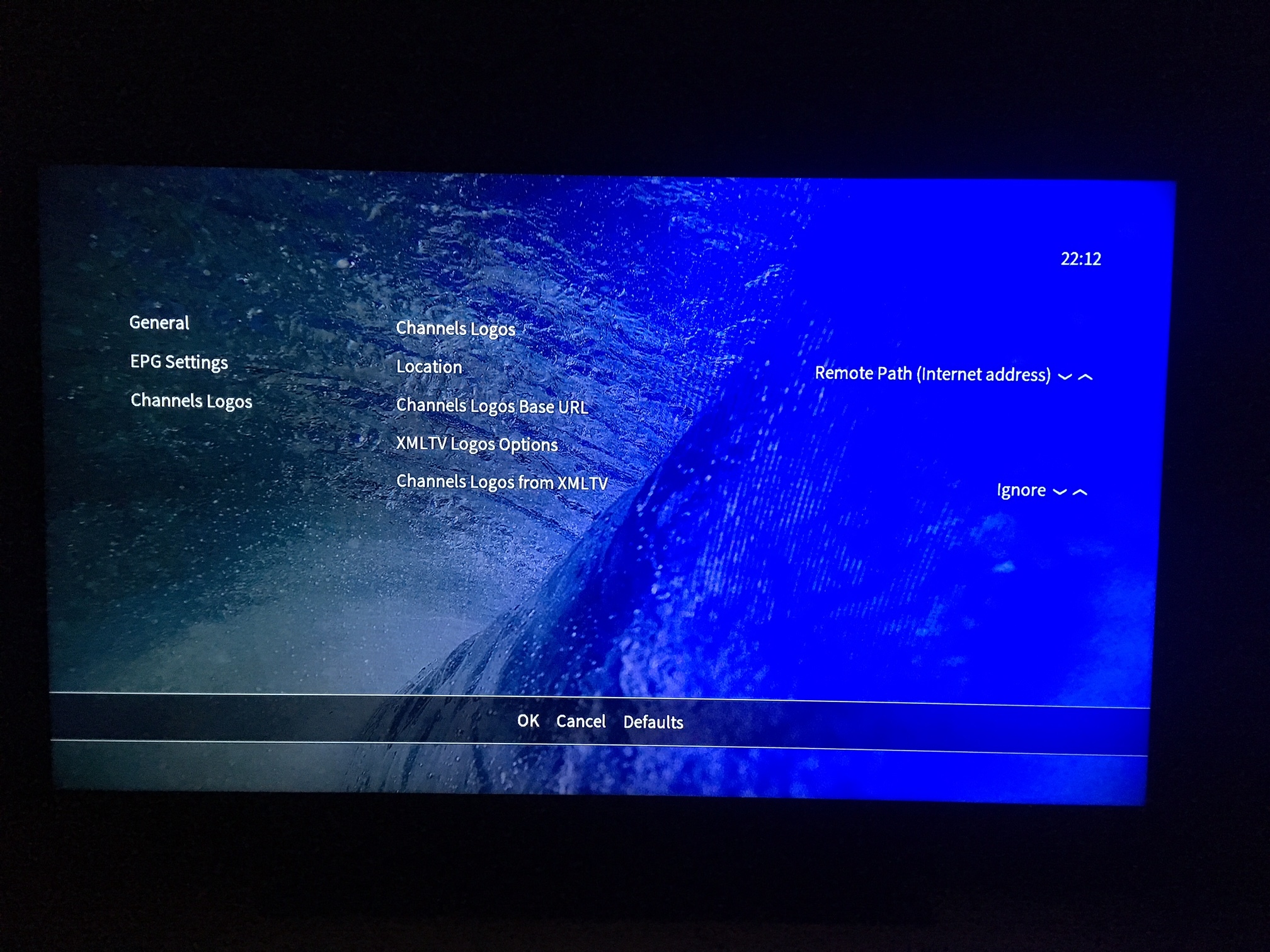
I can see the difference between screenshot and TV is quite stark. Maybe there is another highlight colour we could use. We previously used orange but some people said it didn’t always come up well. I noticed on a projector in daylight it could be hard to distinguish, so we moved away from it.
In the previous theme, with the orange (I always saw it as a very pale, almost white, yellow) it was just as hard.
Specially in any menu where I needed to input some text, I had to squint to see the “yellow” on white.
I’d say keeping all the menus with white/grey text is a good way to keep the skin consistent and neutral throughout all the menus, the bold could be the answer as it’s not too intrusive yet could be a clear indication of where we are in the menu. No text zoom like in the main menu, just adding a bold on the already white currently selected item.
I’ll try to see if I can keep the same vividness and change the gamut.
I can’t see the difference from viewed items in a list (TV episodes) and non viewed items. In confluence there were these checkboxes that marked a movie/episode as watched. See this screenshot I found: http://images.skeedz.com/kodi2.png
Is it possible to let the name of the current running file scroll from right to left when searching for subtitles. The files I play usually have large names and don’t fit completely on screen currently.