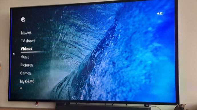
Id love to see an enhancement to the OSMC skin to allow for improved views of the various video sources we have.
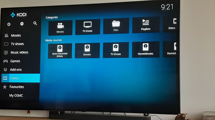
If you have , as i do, seperate directories of Home Movies , Concert footage and other ad hoc categories actually getting to them with the OSMC skin takes a click or 2 more than Estuary/ Confluence.
I’d love to expand the left hand main menu to include the various sources i have . I think some skins allow it but having tried it in the past it wasn’t simple to do if it could be done.
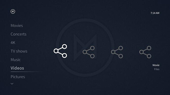
But for now all of those other sources live under the Video menu item. In Estuary i click that and i see my sources… in OSMC skin i click on it and i don’t see them and i have to click again somewhere else to see those sources. Any chance were can move those items to wirk same as Estuary ?
You can completely customise the home menu to your liking via the skin settings and the option ‘Customise Home menu’ after you’ve enabled the feature (if not enabled, the first entry in our skin settings will be ‘Enable menu customisation’ which you have to click).
1 Like
If he enables the widget view is it possible to get closer to the Estuary layout in the GUI than this?
You can set more than one widget with our skin per home menu entry, yes. It wouldn’t show exactly like in Estuary, but it would result in the same amount of button presses needed.
1 Like
Thanks for this - only just got around to looking at it. I can see the customisation option so I enabled it.
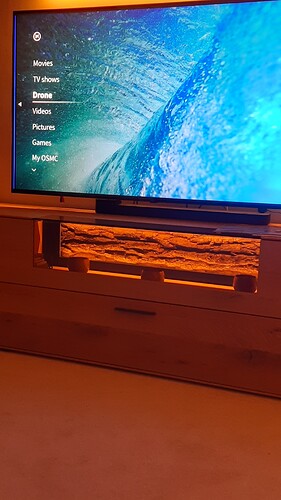
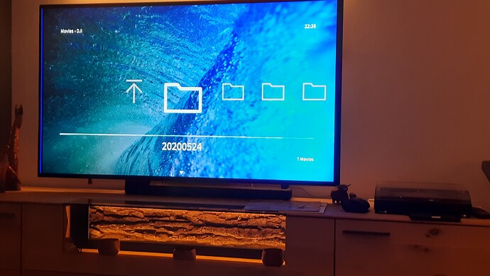
So I changed the Music main menu item to ‘Drone’ - to show Drone footage on my NAS mounted drive . Configured the action for it to ACtivateWindow(Videos, “/mnt/mymounteddirectory”,return)
So it kind of works but When I highlight ‘Drone’ in the main Menu I have to click it to show the directory noted above . So far so good but the layout is just a bunch of the directory Icons at that level. A list would have been a bit nicer but I dont see where to make that change if possible?
I cant help but think the menu system is just awkward in this respect (I know it goes back to Xbox) and it would be so much simpler if you could just add your new menu items ad nauseum or amend the existing one’s to just point to any ‘mnt’ directory , tell it whats there (movies/Music/Non-Commercial) and have it show in list form (or other form) whats there. All it shows is File View which for me means these directory icons only unless I am missing something - ability to add thumbnails to these ‘directory’ names would also be good .
Anyway I am sure its complicated and I am no expert so I will defer to those who know better than me and thank you again for any help you can provide… it really is appreciated .
What you want to do is make a playlist that points to that source folder and then add the playlist as the menu item. There is currently issues with directly pointing to a source folder from this skins customization menu. The only other way I know of is a bit involved.
As for the view you can change it in the slideout menu but you are looking at folders because you are pointing to a folder that has folders in it. It sounds like what you want is for them to be in a library view, which is possible, but a fair bit of work may be involved as you would need to make nfo files to provide the information that needs to be displayed as your doing user generated content.
https://kodi.wiki/view/Custom_video_entries
1 Like
You can change the view easily by pressing the down button on your remote and toggle through the views in the submenu. The default view normally is the list, but it’s currently not due to a bug I missed.
See this wiki article as well: The OSMC Skin
1 Like
I could do the .NFO files - not too much of a hardship as there arent hundreds of video’s (maybe 50+) …
I will continue to see what I can do
1 Like
