When selecting menu items that are two or three menus in - you cant really tell if they are selected or not. earlier menu options at 1st or 2nd stage, the text gets bigger - while 3rd menu items just go bold, but its barely noticeable
The menu item selected above is ‘Audio’ - its quite hard to see.
The menu item select above is ‘Input’ this too is barely different than non selected items.
Could this be changed?
Your colours look completely off here.
Is this how it looks on your TV?
Try taking a screenshot and you should find the highlight is quite discernible.
This is exactly how it looks on my TV. Im using Rpi2
Everything else is fine in terms of colours.
What should it look like?
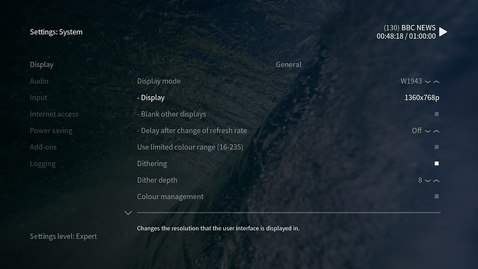
I’m going have to agree with Sam here that what you’re seeing isn’t consistent with what I see myself. To give a comparison, a screenshot from the machine the skin is developed on:
Which to my eyes looks a lot clearer as to what is selected than your screenshots. That would suggest to me that the contrast/brightness on your TV aren’t calibrated correctly.
Having said that, we’re aware that there are still some issues with highlighting the currently selected item in areas such as the settings and we’re working on them 
The weird thing is that I have recently bought a new TV and the display is exactly the same as the last one. My Radp-pi has several updates recently with various OSMC updates - so I dont really know what is going on, and why this would be different to everyone else.
Also - this would be the only source on my TV that I am having problems. Very odd
Also Ive noticed @BobCratchett that your screen image looks different to mine.
I dont have the option ‘dithering’ in my settings/display menu.
Why is? I have the most recent update installed for osmc on my rpi?
Gamut is wrong.
You can adjust this on the device or your TV. I have the same on an LG TV if I select ‘PC’ instead of ‘Blu-ray / Set Top Box’ as display mode
I’d really encourage you to use a site such as LCD monitor test images (the first that came up in a search, not necessarily a recommendation of this as the best service) to get some test patterns so you can check the brightness/contrast/etc settings of your TV.
Different settings will be displayed depending on what settings level you have selected within Kodi (see the bottom left of the screenshot I provided). My screenshot has ‘Expert’ settings enabled so will display all possible options. If you have a lower level selected, you will have less options displayed.
Edit: It’s also worth saying that the skin isn’t developed on an OSMC device, so it’s possible that there will be some options native to the device used (a MacOS device) that aren’t applicable to an OSMC device such an a RaspberryPi or a Vero device. The fact that different options are displayed, though, doesn’t affect the visibility of the options that are displayed.
1 Like
Well guys you were right. My contrast settings were wrong. Weirdly enough it’s a brand new TV and when I selected ‘return picture settings to default settings’ in the options - contrast went back to 100%. Ive changed this now and it’s better. Thanks

