First of all, I registered specially to communicate about some of the changes I’d like to make in the skin. Don’t want to do anything you lot don’t want or maybe some of you got better ideas!
Advanced user of Kodi and got a really nice setup (in the first place specifically for PVR do I don’t have to rent a box I don’t like).
Anyways these are the things I want to propose;
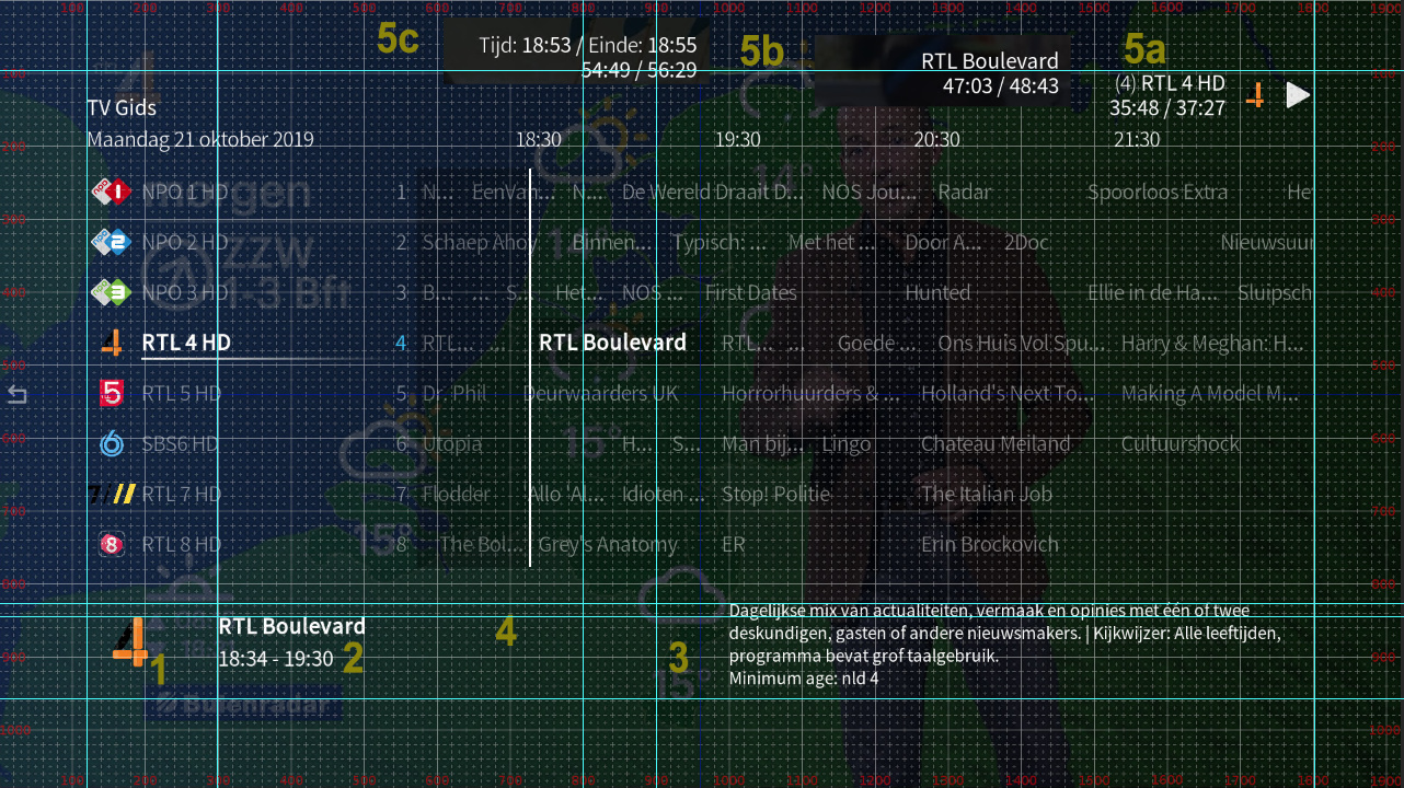
I’d like to explore if the logo can be a tad bigger, I’m using rectangular logos (800x450px) rather than square ones as those work way better in my opinion. So that’s my reason.
Here I’d like to add the program genre. Either in front of the time of in between as is usual with other skins. I’d like to do the latter, but many US users don’t have access to EPG data while in the EU this is quite normal. For me it’s 10 days worth of it. That’s why the first option might be the preferred one; if you don’t have access to EPG data you don’t see anything different, else you get it in front. Up to debate I think.
A bit more space to the left, I get good quality and often long EPG data and also I think the space in between the logo/time/genre is quite big. Maybe add an option as how fast this text is scrolling skin wide? common skin option.
Case of OCD; I don’t know why this isn’t lined out in the first place.
5A/B/C. Don’t like this at all. In fact there’s more stuff I want to propose but nvm that for now. First I think the pace is too fast. Maybe add a setting for that too? maybe 6~7 seconds works better. Also is 3 parts really needed?
My proposition;
Switching between 2 parts
1;
Channel name (channel number)
Programme name (% duration)
More in check with how it is for music/video
2;
Time
Date
(make this a skin wide thing too, maybe? )
Also I don’t know why one wants to see the channel logo here but w/e. I’d rather see the weather icon with temp here. Not even trying to attempt this one. But maybe you like it better too and never thought of it that way, so there you go.
I’m not an advanced skinner, but I do know what I like and how it should work. Also plan to keep the minimalistic layout in check; quite fond of that. So don’t expect me to propose anything wild. For the first try (well actually 2nd try) I’ve chosen some stuff I think I can manage. Want to attempt this myself in weekends so don’t don’t this will be done anytime soon even though it might be quite simple.
Thanks for your requests/proposals! I’ll reply with some more time (which I don’t have this evening). The detail in which you explain them is very much appreciated
Sending a PM is quite trivial actually: You click on my avatar and then you’ll see the blue button “message” come up…
That shouldn’t be an issue. Will check whether there’s a good reason for this or whether it’s simply been overlooked.
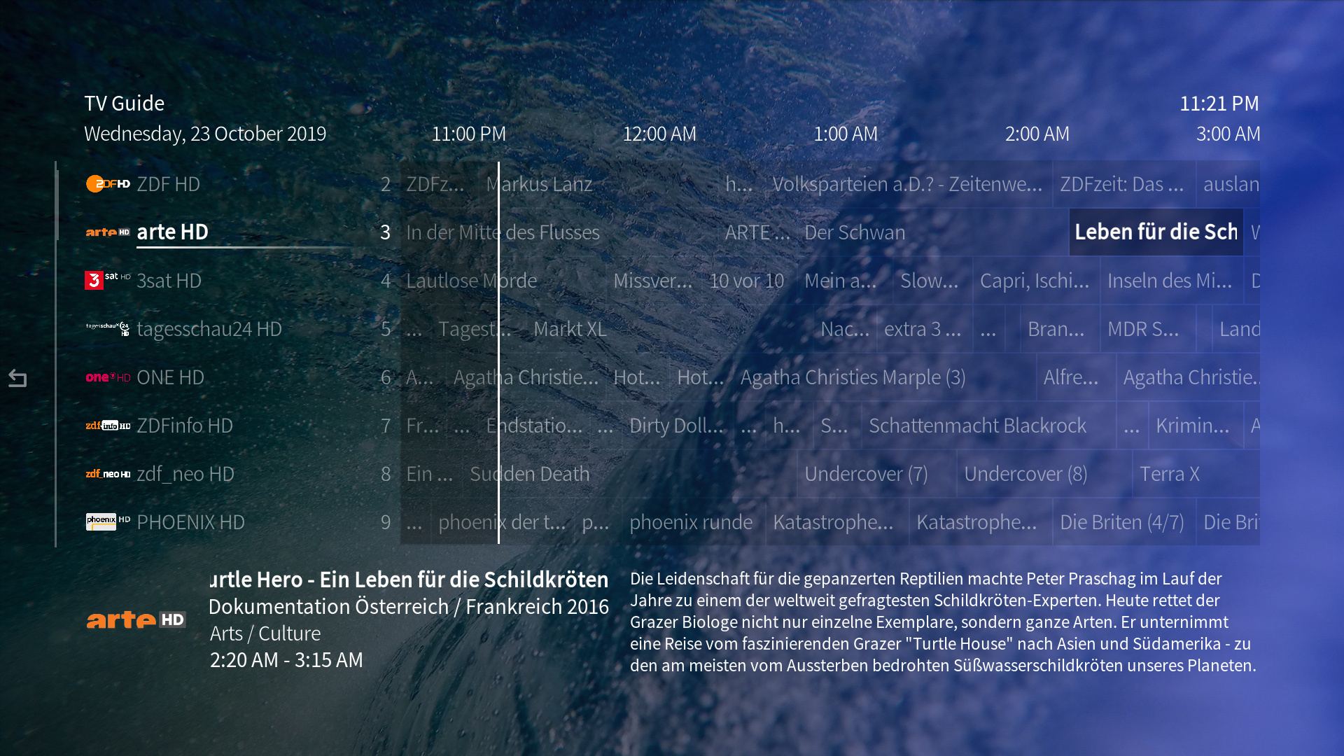
This one is not as simple as that as that control box can also contain a third line with a second description line which we have here in Germany very often - a second title for the program. Adding the genre to the time doesn’t seem a really good idea to me. Normally, in all other places of the skin where genre in visible in library windows, the genre would be below the title for sure, but not entangled with times or duration. I’ve had a look at this before already when you mentioned genres over at Git… Haven’t come up with a perfect solution. Will check this out again and think about how to add this
The reason for it to be that far on the left is to give the title box on the left the same horizontal space. Here in Germany, titles of programs and especially the second titles are often quite long. To prevent too much scrolling, this was a compromise to show as much of the titles as possible while having a decent amount of space for the plot. But I can have a look whether there’s a better compromise
You seem to be right. I’ll have a look why it’s not alligned properly. The idea was (but somehow it failed) to have the left controls (icon and title, etc.) aligned at the middle of the right control box. Will fix this
I have to elaborate on this one a bit as it’s already systemwide and the spacing and position have a good reason… The bottom edge now playing information is aligned to the bottom edge of the window heading on the left (‘TV Gids’). The lower line of the now playing information is always reserved for the playback time - whether it’s music or video playback (PVR is handled the same way). The top line has more space available than the bottom line as there’s no window heading in the way on the left. So, the aligment on the right at that very position has two reasons: as much space as possible horizontally for long titles (especially useful for long music titles that will show above all other window elements on the top, only scrolling with extreme length) and being aligned on the bottom with the window titles. If you’re in the home window, the alignment also works with the OSMC logo in the top left corner which should be aligned to the middle of the now playing control box.
Regarding the amount of elements: we could certainly move the information visible in your 5C to the bottom line as well - putting all time information in one line. That might actually be a good idea Besides that I wouldn’t want to change much more as there’s a systemwide logic to what the rows of the now playing dialog are used for (see above).
EDIT: Missed something here. The duration we can adjust, yes. Will look into that. Adjustable scrolling speeds I can also look into. Should fall under the category ‘readability and visibility improvements’. Not sure though how trivial it is. Scrolling of one-line horizontal text is not as trivial to adjust as the plot/description text boxes. But those I can at least look into - the font size of those is already adjustable in the skin settings.
The icon there is also a systemwide feature for all playback scenarios. The icon is basically showing the player icon - which can be a music album cover, a movie cover or the PVR channel icon. This is strictly related to the now playing dialog which I honestly wouldn’t like to mix with a different element: weather. We’ve got the weather home menu entry and widget for that. We’ve not had the request to show weather everywhere before and space-wise it’s not a good idea to go there IMHO. It would mean even more information on every screen than now contradicting this approach:
Thank for your input! I’ll have a look at the issues and see whether fixing a few things can be done quickly. Will update this thread with news on that.
This way we have all time information in the bottom line and all title information in the top one.
BTW: You can also see here that the icon is always visible for every type of playback in the top right. EDIT: This is now implemented and commited: Now playing and window heading improvements
I have to correct myself. Fade labels are used here to show the label information and replace it, if there’s more than one to show. Unfortunately, there’s no way I can see to adjust the time each of the labels definded in one fade label control are visible: https://kodi.wiki/view/Fade_label_control
What I didn’t mention, 800x450 is 16:9. It’s not just a better working ratio for me; here we can also get a screenshot of the program (Also for German TV channels!). So in a far far future I might look for an If this else that resolution here. But not anytime soon.
Have been thinking about the genre, I think I figure that out as there’s room for a 3rd row. So that might actually be easy.
I do have German EPG data too and don’t spot long titles often or at all, strange. Well not a big priority for me atm.
I actually prefer nothing at all here. And I do think weather works as an option, have seen it at least 2 times mentioned here at the forum. But I won’t touch this at all as it’s skin wide, as told before I won’t touch anything skin wide for now. Don’t want album art here either so sooner or later on my setup it will have to go. And if I ever find a nice way of adding options here I might suggest a commit.
Short about the rest, I’ve seen some of the alignments as such with the logo and will document some stuff for myself now first so in a later stadium in can be found. Also looked a bit around the code and getting some decisions now which are probably now a bit of a pain. Some of my suggestions might work a bit better in a later stage. For now the skin needs TLC first and improvements later.
The icon has now increased in size horizontally and vertically (150 pixels) same as the space for the title, etc. information and the plot box. The genre is now included as you can see.
This screenshot also serves as a perfect example for long titles and secondary information. Didn’t have to search within my EPG for more than a few seconds This and the fact that we need enough space for the plot (which you asked for as well) also explains why it’s not really possible to give the icon even more space horizontally. But as the icon will be scaled properly within the image control, both square and rectangular icons should show just fine.
This was trivial to do: If available, the icon will now show the EPG program’s icon and not just the channel icon. If the EPG program doesn’t have an icon, it will fall back to the channel icon.
You may remove it on your setup, for sure We have one policy though that’s important to us regarding skin settings: No settings for tiny, little adjustments like this one. Our skin settings are not supposed to turn into a plane cockpit.
All of the now shown changes are commited (PVR grid improvements) and will be available with the next update.
Will check the changes later, now that I know what to look for German EPG data will have a look for it. Do have ARTE so that will help. (ARD/ZDF/WDR/NDR/RTL/SAT1/ARTE).
As for those small things; I know. For now I don’t know how and even as an option it’s problematic. This needs a lot to thinking but do have some idea. I don’t like it either to have a single setting for it.
As discussed before I will add some screenshots to this topic with argumentations, all things I’m prepared to do myself. So far haven’t looked at it yet nor had the time.