Hi!
Please do not take this as critique  But I thought I’d forward the comments I got after the upgrade. You see “wife acceptance” is an important factor I knew beforehand that the old skin was going away though…
Background: Skip background image altogether? I tried deselecting but found no way to do so.
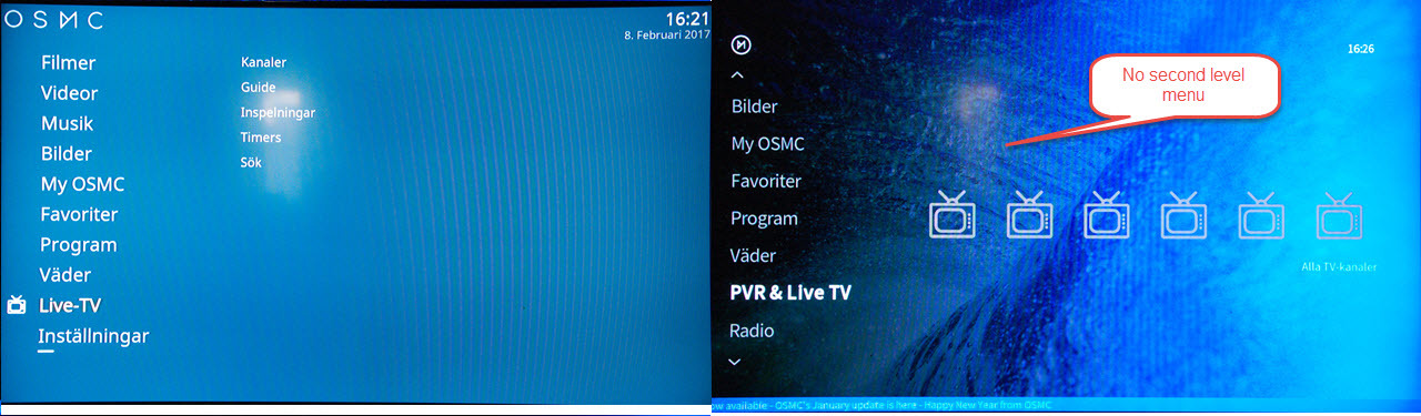
Pvr&live tv: One menu level missing. Ok you see the channel icons on the
top menu, but what use are they as there is no programme info? Hit Enter and
you are deposited into the epg. You then have to arrow left ro get the
foldout menu and select channels.
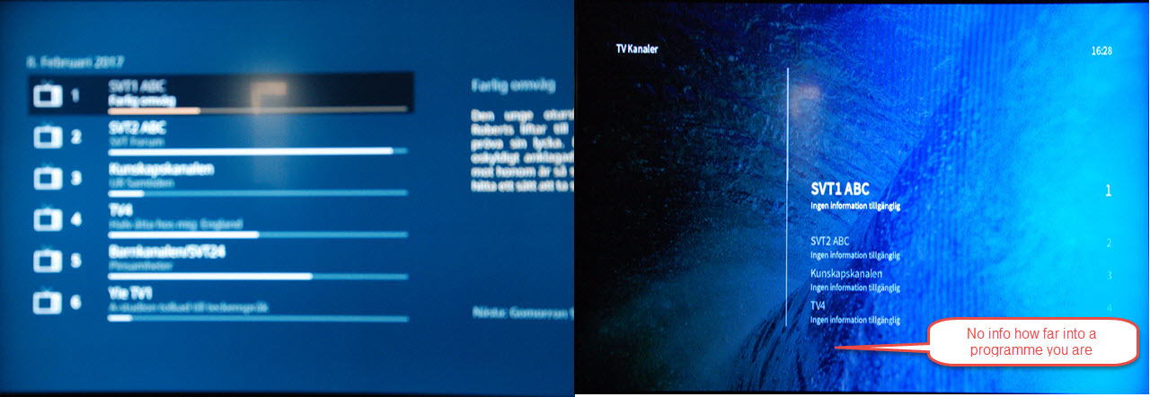
Here you see what is on and whats next, but not the position in what is on. That was much better in the old skin.
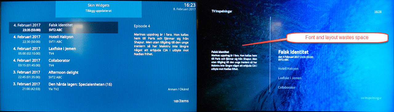
Same for recordings. In essence, there are several more keystrokes to get where
we usually go.
Is there an easy way to tweak this or do you have to hack xml-files?
Why? Maybe allow a user to select their own background image instead? This is the way we are leaning.
Can you take a photo / screenshot of what you mean, and what you’d prefer to see?
Yes. I will do do tomorrow. I still have a copy of the old OSMC on SD. I realise that it is hard to explain in words. As for background, an used-selectable is fine, but why not have a nice blie colour like the old one, if none is selected?
The general consensus was that the background was better than the blue background.
If it’s possible to accommodate both choices we will look at doing so.
I realise that opinions differ. I like a clean look.
OK. Let me try to elaborate. I apologise for the pictures. Camera had problems focusing…
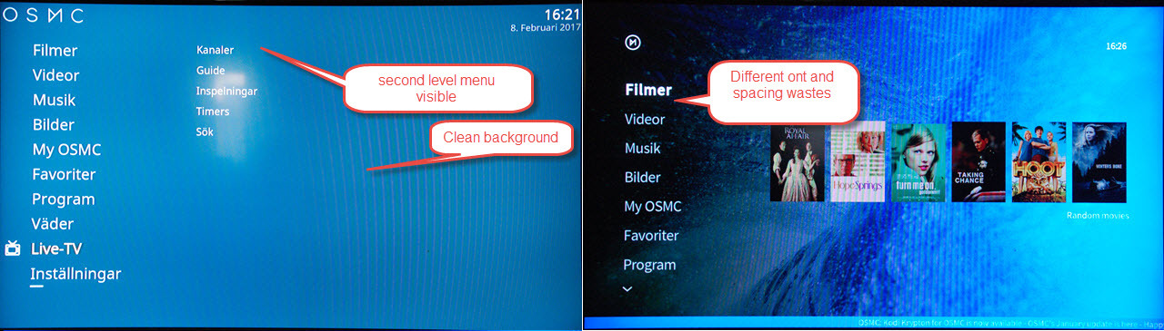
Initial menu:
Watching TV:
Note how in the old skin. selecting Live-TV brings up a secondary menu. In the new skin you just get icons (if you have bothered defining them)
This is the channel view, in the old skin you saw a lot more channels and the relative position of the currently playing programme. In the new layout you see channel, program and next program. There is no indication that you might just have 3 minutes left (so there is not much point in watching) unless you check the time.
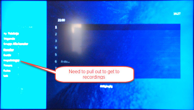
You need to pull out the menu to get to recordings
recordings, again a whole lot of wasted space
Some suggestions for this have already been proposed
The plan with the new skin was to use the space effectively, but to avoid overcrowding which we had with the first skin.
Thanks! Will try that next time. But I hope I got my points across?
Yep. I will contact our skinner and designer and see if there is a good way we can take this feedback on board.
Perfect! It also seems that my other issue was fixed. Will post in that thread.