We’ve been working hard on improving the skin and have taken many of your suggestions on board. We’d now like to put our latest work out to testers to get some further feedback.
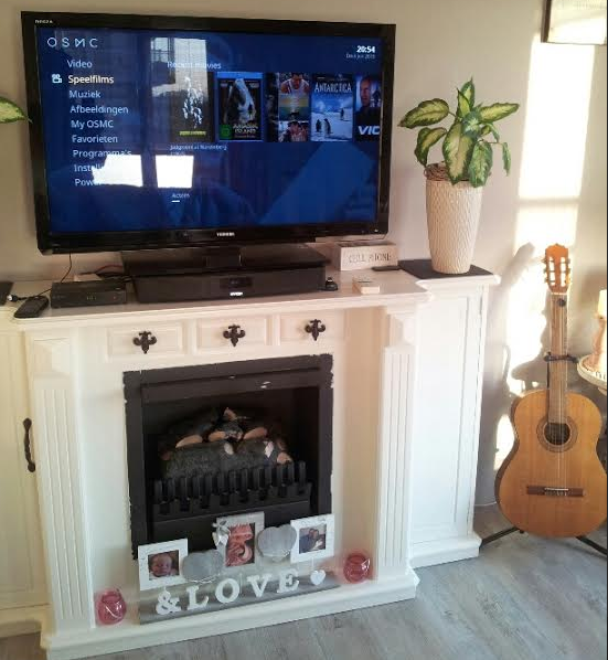
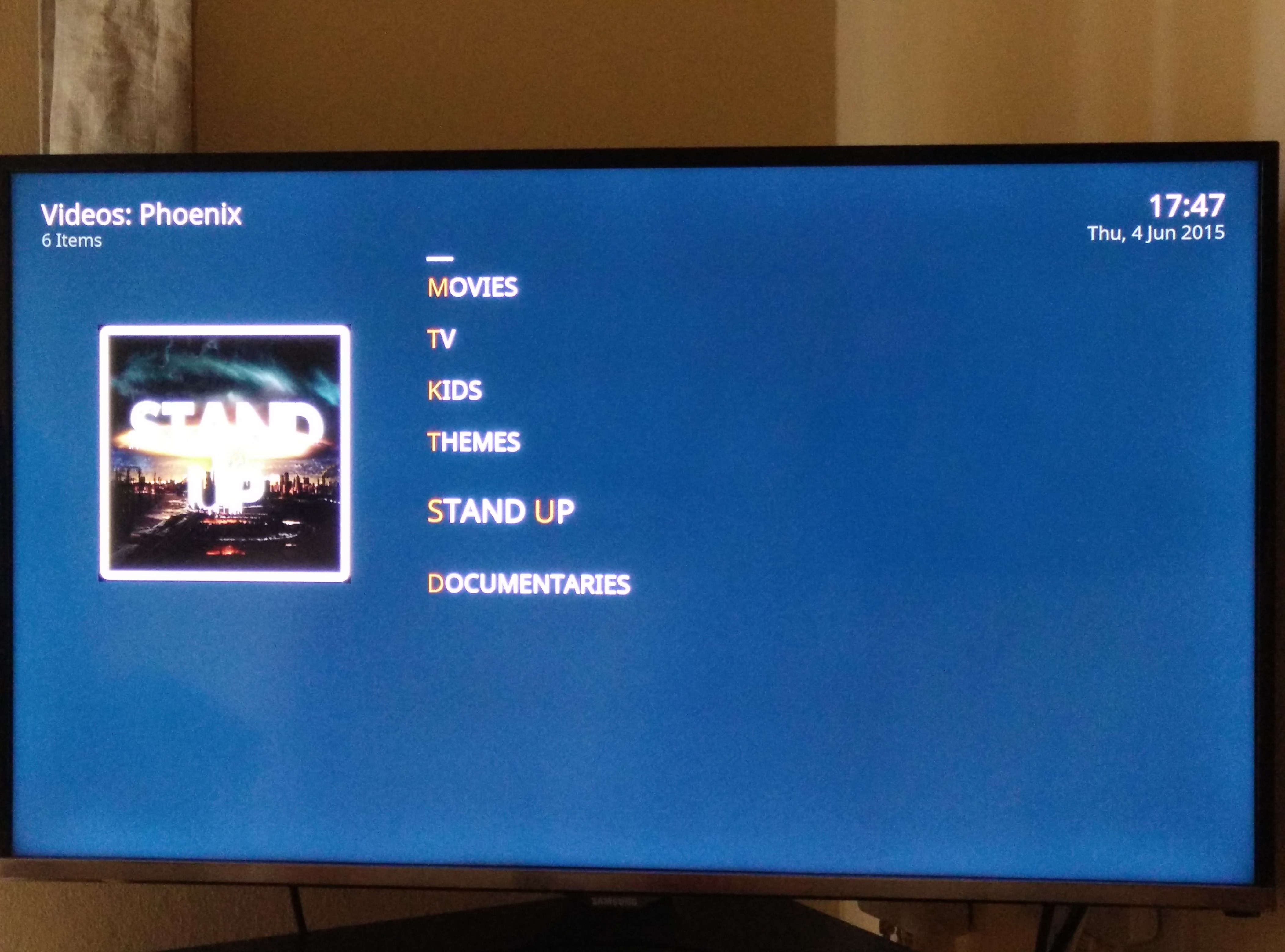
The new OSMC skin features mouse support as well as multiple view layouts for movies, music and TV shows. We have resized the skin to fit more menu items on the home screen and we feel this is the right size for a 10-foot display.
We’ve made it easier to see highlighted text as well, so you know what you currently have selected when you’re scrolling through menus.
Please try our new skin and let us know how you find it. To do so, connect to your device via SSH and execute the following command
wget http://paste.osmc.io/raw/sewarujihi -O- | sudo sh
@sam_nazarko, first many thanks for all your efforts. With opening feedback to the skin I guess you open the door for many personal opinions on how it looks which will be impacted by many individual factors (screeen size, distance, color/brigthness settings…).
Personal I now find the font on the main menu to small. I would have kept the main menu fonts bigger than the submenu fonts.
And I also find the scheme overall now too dark.
This is a tricky one. The other home menu may have looked more appealing but some complained the text was too large and didn’t permit enough menu items.
Yeah, that is what I ment within the thousands of users you have there will always be many different opinions. But as you anyhow have to scroll even with the new reduced font size (at least if you add your own menu items) I find it discusable. But anyhow let’s get a version out that appeal to most of the users and than we might just can put a wiki explaining how changes can be done.
The only problem I still find is that it’s hard to see highlighted text when the text you are passing through has its own color. Now that the font size changes when it highlights the text it makes it easier, but still a bit annoying some times.
I’ve seen it in other addons that use its own colors for the menus too. Won’t mention which ones. But there might be addons out there that use colors and have the same ‘problem’. Just saying.
In general it looks good. Not to sure about the metadata from movies thought. Big blocky gradient boxes does not fit in with the overall feeling of the rest of the skin. They feel a little stretched too.
The more viewer options are nice . Personally I’m still hoping for a list + info choice like the one Amber has. But that I can live without.
The clearer highlighting of active choice was a big improvement.
Also it seems like the recent movies section does not load all icons. I get the default Blackbox video camera on several items. Issue does not seem to appear in Confluence.
I think it is a significant improvement and looks good on both my 50" and 32" television. First glance so will add any issues or bugs I find, but good work.
Indeed. A number of addons make assumptions about the colour scheme of the skin and assume that the user is using Confluence - if you use a radically different skin then these addons will not look very good or might even be unreadable in places. Not much that can be done about this on the skin side.
I liked the previous one better.
With so many menu items at once it gets messy, also you cant go from top to bottom or opposite.
The background is too dark.
On the plus side; now you can see what you’ve marked, thats nice, and the view in weather is fixed.
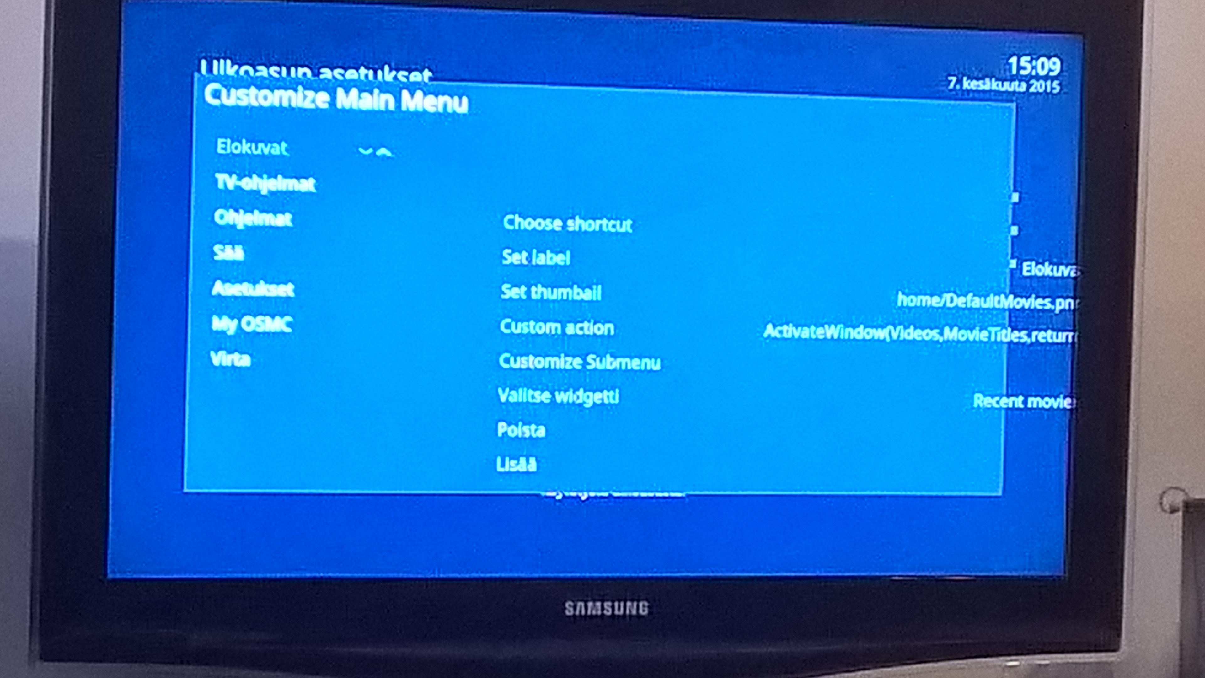
Customize main menu doesn’t really look like it should…
Also I’d really like to see IMDb points and movie duration in ‘list’ view and more information about movies in ‘big icons’ -view (Year, genre, duration, IMDb points).
I definitely like the smaller font on the main screens. I too have noticed the menu customisation screen is messed up. Also the horizontal menu doesn’t do anything which is the view I most want to use. It would be good to make the screens more transparent so that the artwork shows through as it’s still very difficult to see it so is a bit of a waste. In all a good set of improvements and I look forward to seeing other people’s comments. Keep up the good work.