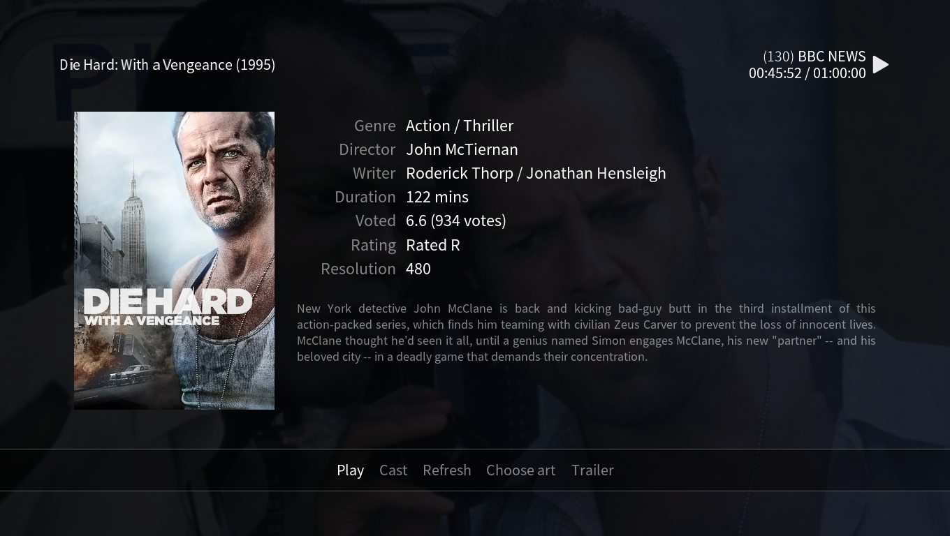
Compared to prior OSMC skin in kodi 16 the font size is too small on the screen my RPI is connected to. The same for the piscture displayed on the right side when highlighting the movie or tv show menu but that’s minor compared to the font
Yes, it would be a shame if all that good work came to nothing. the old skin was really good and I used it on PC and Android, but Estuary has edged ahead for the time being IMO.
This is an area I genuinely find fascinating. The broad aim of Kodi - and of the default OSMC skin - is to present an interface which looks great on a TV at the optimal viewing distance for that device. The difficultly we face is that there is plenty of information about what the desirable viewing distance is for a given screen size, but there’s very little about what is the ideal font size for a given screen/viewing distance.
So, the general font size is something we need to discuss internally to ensure we’re providing something that is large enough to read at an optimal viewing distance. In these instances, though, I tend to defer to those who have the time and money to do the research into these things - so I think that looking at, for example, the ticker bar on a news channel is probably a good reference. Looking at the BBC News Ticker and an example text in the skin that is being referenced:
In the spirit of constructive criticism - I’ve just done a quick comparison of OSMC vs Estuary skins and find that actually for much of it the fonts are the same size, but Estuary is much more readable. What’s different is basically:
Estuary fills my screen (I have overscan turned off on the telly) whereas OSMC has wasted space; and
Contrast between text and the default background is not enough on OSMC.
The old OSMC skin also suffered from lack of contrast and difficulty telling what had focus but not really enough to complain about. Whoever has the means to fix this might like to google WCAG and also bear in mind that older tellies are often going to be re-sampling to 1360x768 from 720p or 1080p.
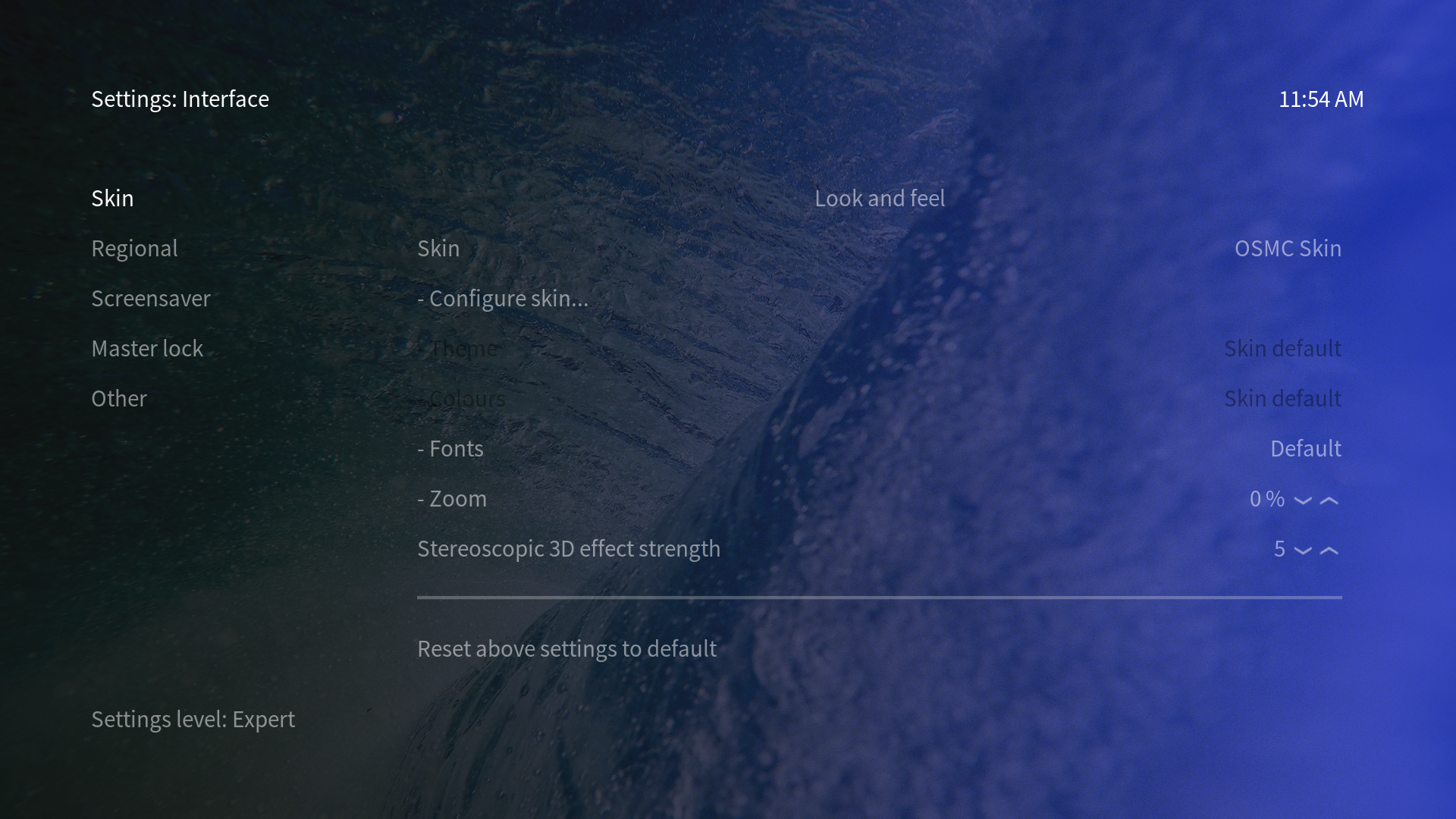
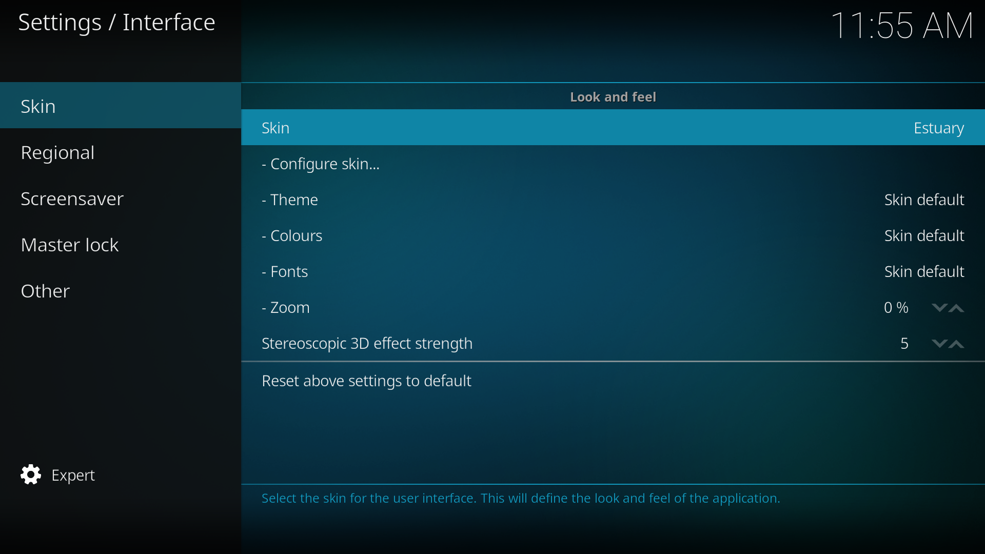
I’m all for sexy graphics, but IMO readability, especially in the settings menus, should take precedence. For example, what options are available here under Configure Skin?
With regards the two options you’ve highlighted in the settings screens, they’re disabled in the OSMC skin as we don’t provide different theme and colour options. Whilst I’m happy to look again at the colour we use for disabled items, as they’re not available to select they’re not a priority for readability.
In general, as we don’t use a box to highlight the current focus, but rather white-for-focused-grey-for-unfocused, it’s definitely a bit of a balancing act getting readability and highlighting which item is currently focused. We’ve had some internal discussions about it and - when I get the time to actually do the code - there are a couple of changes coming up for each in a future update to the skin.
In terms of highlighting items in the settings area (and other areas where we can’t easily bold the highlighted item as we can in media lists), we’re going to add an extra indicator to the left of the currently selected item.
In terms of readability, we’re aware that the blue colour on the background can be, for some users, too bright - particularly in terms of the contrast to text over it that you’re talking about. We’re currently evaluating what additional background options to offer (from a technical perspective) - though I believer I’m right in saying it’s been agreed that, whatever the final implementation, there will be the option to have an all-black background for users who prefer this.
Thanks for that. Good to know it’s being worked on.
There’s a difference between ‘disabled and capable of being enabled’ which we want to be able to see (ie what we might be missing!) and ‘not available at all’ which probably has no business taking up screen space. It was just a frinstance.
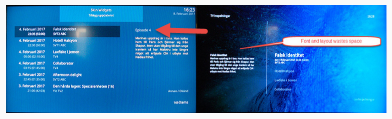
While I’m on, please also have a look at the screen I use the most - TV Guide. By squeezing a longer timeline in while using the same size font as Estuary, and including channel icons and not using the whole screen, many more show titles get truncated.
Just another notes about selection in file manager in OSMC skin (cannot tell Estuary): I often copy files for people but multiple selection is not clearly visible on my screen. The selection is well made: space bar and the focus goes one step below but the reviewing selection does not tell me what in or not.
Parts of the same remarks I see above but just to report
Just my 0.02€ worth here. I did provide some screenshots a few months back, comparing old and new and I do like the new skin, but the texts are too far spread out so that you have to scroll up and down.
The colour of the selected item was changed to something more subtle in the last skin update, due to complaints about it being too obvious - particularly when the currently playing media was the item with the highlighted colour. Sounds like we may have gone too far the other way - we’ll see what we can do
If I remember correctly, most of your comments were related to the PVR section. There are changes coming to address some usability issues there, though I can’t guarantee they’ll address all of your specific issues - particularly bearing in mind that having clear space within the skin is a design choice, and we’re unlikely to look again at the bordering and padding that we provide until at least the Kodi Leia version of the skin, but rest assured you did get your point across and there are PVR changes coming, when I get time to complete and test them
(And if I’m mis-remembering, and it wasn’t the PVR section you were primarily talking about, feel free to link me directly to your posts, or to re-post your feedback)
LInk is in my original message. yes, it was mainly PVR, but also general. Ie we used to have the full main menu from top to bottom and it would all fit, nowadays I need to scroll and there is lots of space between lines. This is on a 37" Sony at 1080 resolution.
Honest truth: the number of items we show on the main menu is another of those areas of UX that I find fascinating, not least because there’s no clear answer on what is actually ‘best practise’.
So, for the record, in normal lists - such as when you’re browsing your media - we display 9 items. On the home screen, we display 7 - at a larger font size, and with more padding. One primary reason for this is that it is the home screen - and the fact that we display with a larger font/spacing gives a visual indication that this is as high as we go (which is to say, you can’t go ‘up’ from here).
Another good reason for this, though, is that in what might be called a ‘default’ Kodi set-up, 7 is enough for the primary categories we would be expected to show: Movies, TV Shows, Music, PVR, Radio, Pictures and Programs.
Admittedly, if you add into that the Videos category, which is useful for set-ups without a full local library, and MyOSMC then we’re over that number - and perhaps we need to look again at where these item appears in the list. But, in a very general sense, 7 seems enough to cover the primary items we need to show.
However, thanks to our use of the Skin Shortcuts script, we’re aware that some users will have much more customised home screens which mean they have far more menu items that they might be considered to be regularly accessing.
As the aim of the skin is to create something that works for the majority, and not necessarily for each and every individuals specific needs, its probably worth opening this up to any users who have an opinion - do you have more than 7 menu items that you regularly access? Are ‘Videos’ or ‘MyOSMC’ options that you regularly access, or can we demote it? Any other feedback on the number of items or the way that we display them on the main menu?
Yes. Being a software developer myself, I definitely see the compromises that have to be made. I think I provided screenshots in the last thread that showed some of the things I found awkward.
For us what we use is 80% PVR (Live TV), 15% videos and 5% music. OK, we (or rather I) play a lot of music, but then I gerenally use Kore on my tablet or the HTTP interface on my other Pi, which is headless. Kudos for that btw, it is vastly improved.
Let me ask the rest of the family what they think, now that they have gotten used to the new UI. FWIW what I really would like to have, possibly as an option and I did hack the XML-files on the old iterface to have it is episode/season info.
Recordings from TVHeadend have lots of metadata. On OSMC you see some, but not the episode/season info:
Arrow points to where it is in the old UI. Sometimes the title and summary for recorded series are all the same and in that case, knowing the episode/and season number helps. Wa have a lot of series we like to watch as autorecordings using regexps, ie “banks”, so that any episode of “DCI Banks” gets recorded, same for “Law and Order”. Now several channels might broadcast “banks” and in different order, so seeing episode/season info is a good thing.
As I said, there are improvements coming to PVR. Two of the improvements are better use of the space on the right for info when images aren’t available (at the moment, the layout always presumes an image is available) and adding in the missing infolabel used by some backends for season/episode information
Thanks for the feedback Indeed, we don’t show a border around the smaller of our two progress icons. I’m quite happy to look at whether adding a border would mean these small images are still clear enough (the images are 14x14 - adding a border means we just have 12x12 to make the current progress clear). I’m curious, though, how does the lack of a border make it look like the device is running slowly?
Whilst there are some skins that use the Skin Helper scripts ‘forced views’ functions, workarounds like that are something we generally try to avoid in the default OSMC skin. I’ll look into any tried-and-tested methods to do this that we could utilise, but I’m not sure this is something we could easily provide.