Our v18 Leia OSMC skin

Accompanying our blog post for the OSMC April update that brings Kodi v18 to your OSMC device, we’d like to give you some more information on our improved OSMC skin that we’ve also been working on. The skin was patched to work under v18 and we’ve added some new features as well.

Here are four bigger changes (click on the screenshots to enlarge them)…


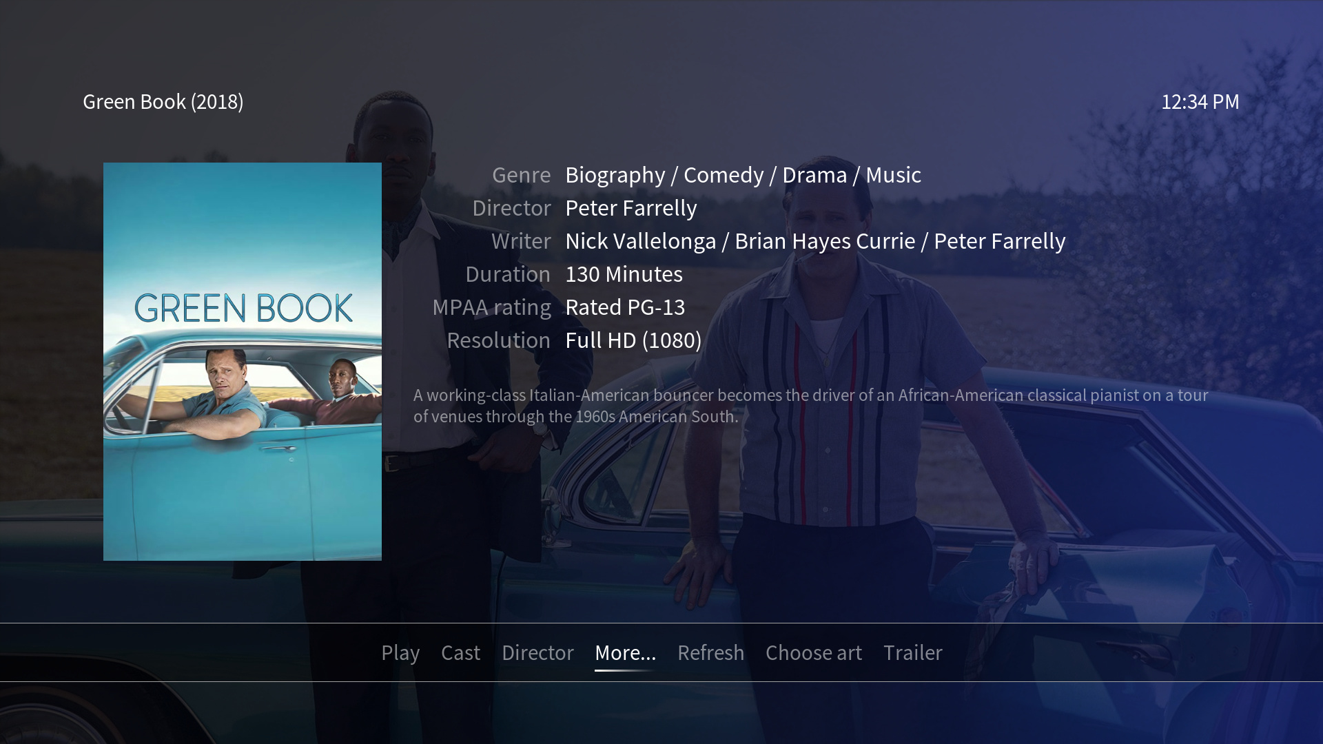
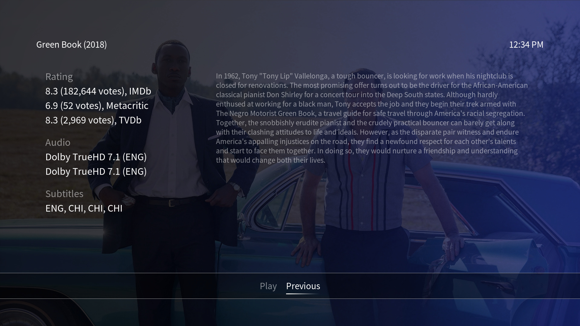
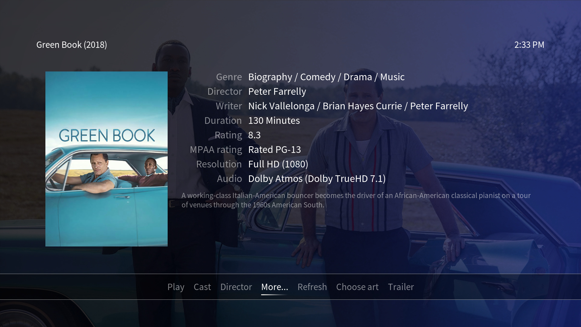
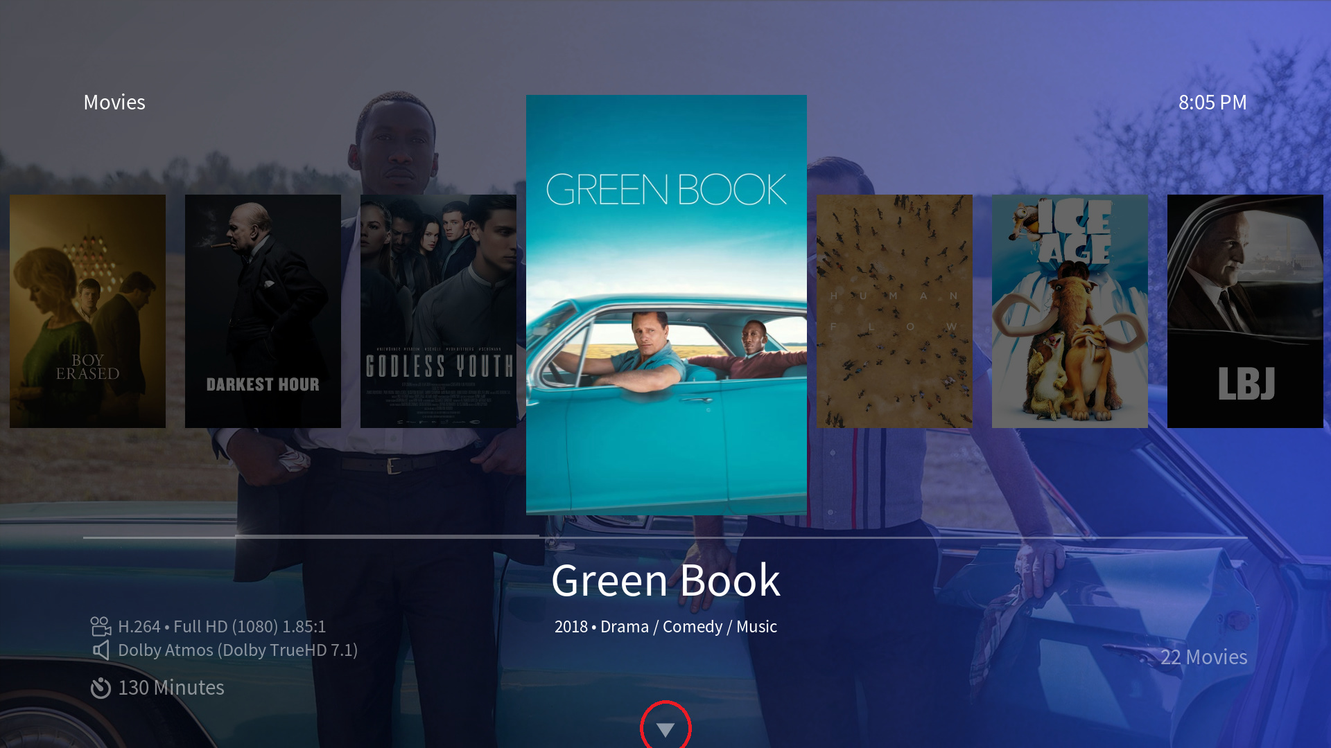
New views for movies and TV shows
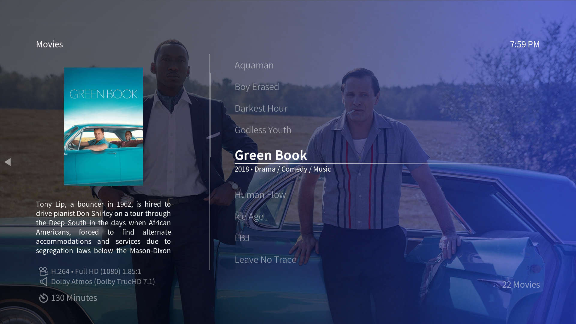

List - info
Basically our good old list view with additional plot information and a smaller cover art on the left side.
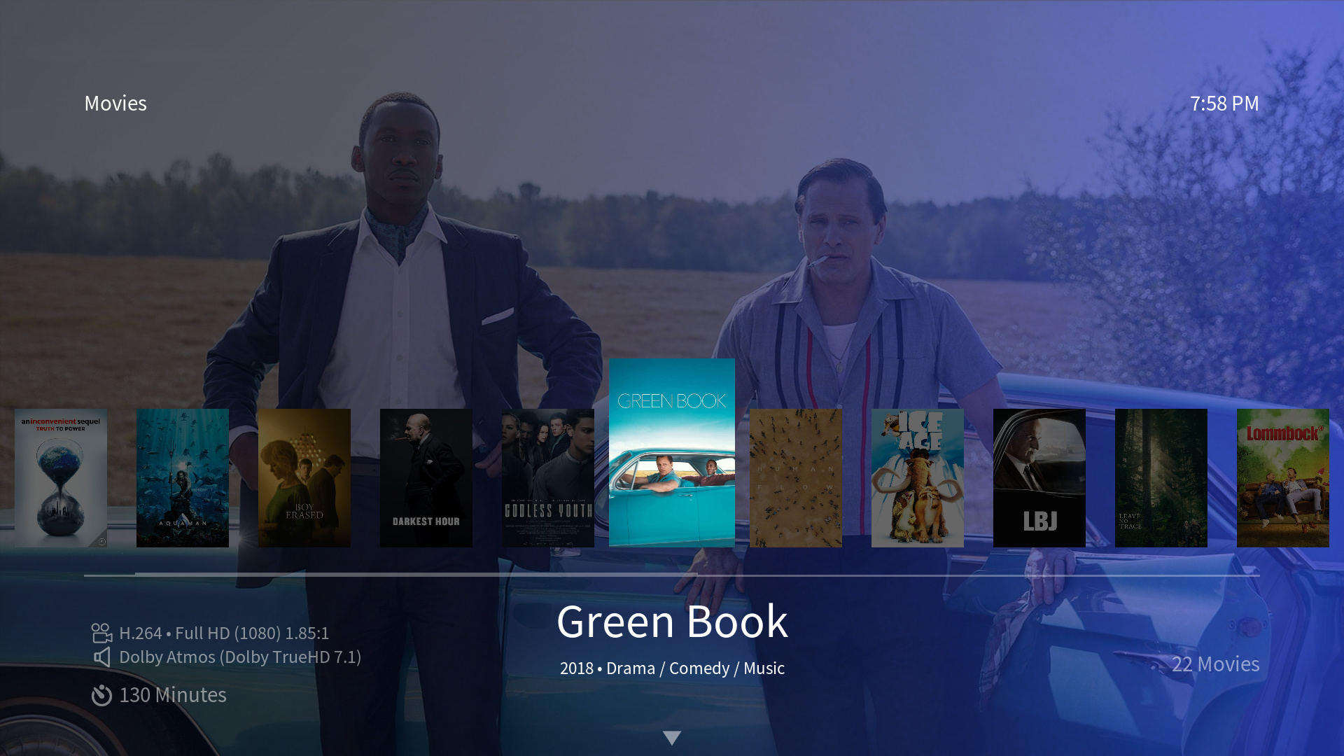

Wall - low
A smaller “low” version of our wide list view - a great option for those of you that like the wide list view, but who like the background fanart even more: the new view with as much background fanart visible as possible.


Wall - small
A version of our wall view with smaller cover art - especially nice, if you have a huge movie/TV show collection that you want to quickly browse through.
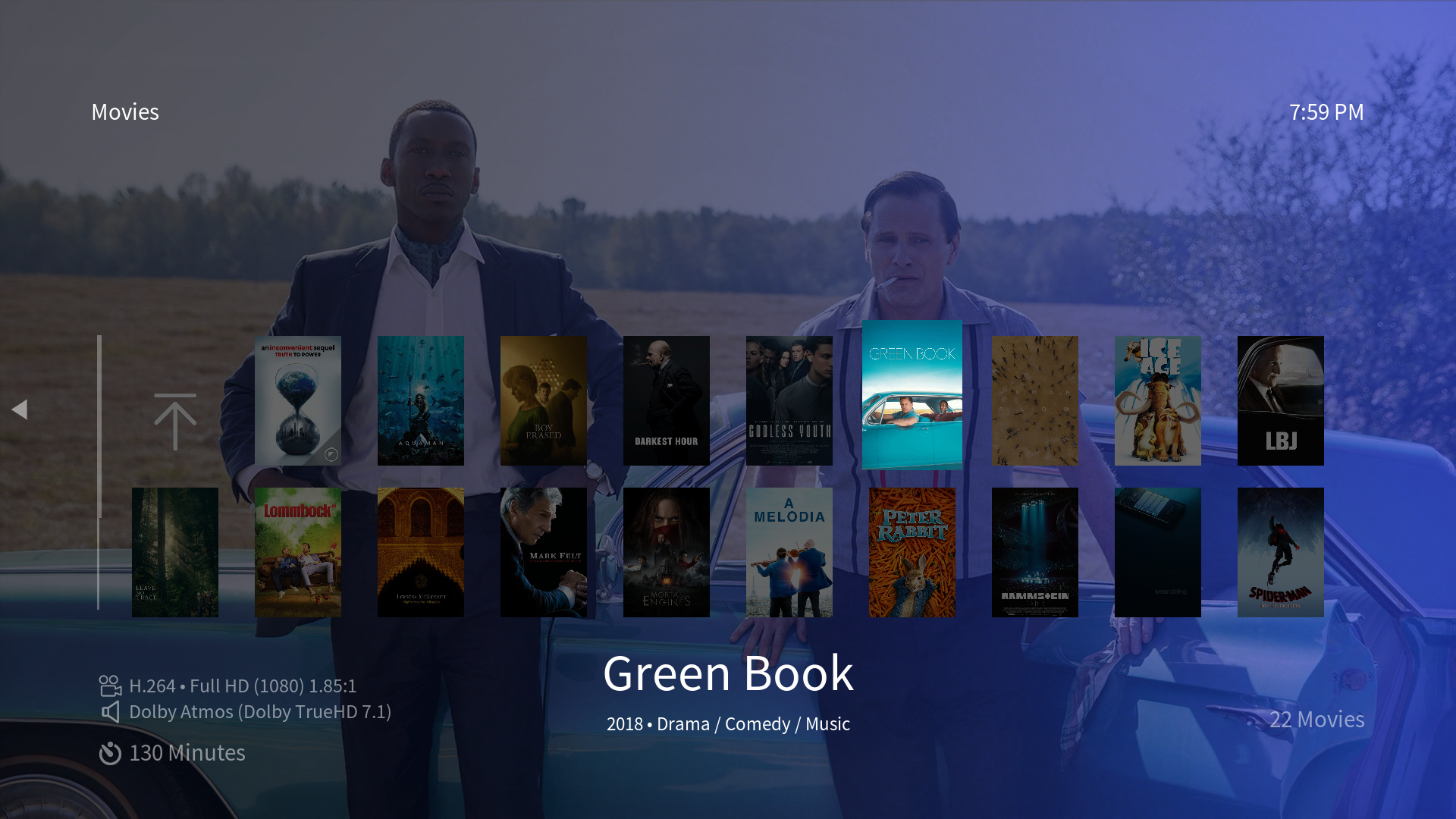

Wall - info
Taking the new small wall view, taking a few columns away on the left and adding plot information.


Wall - low
Our new smaller wall view with only two rows - useful for those that would like to use the wall view, but are keen on seeing more of the background fanart.


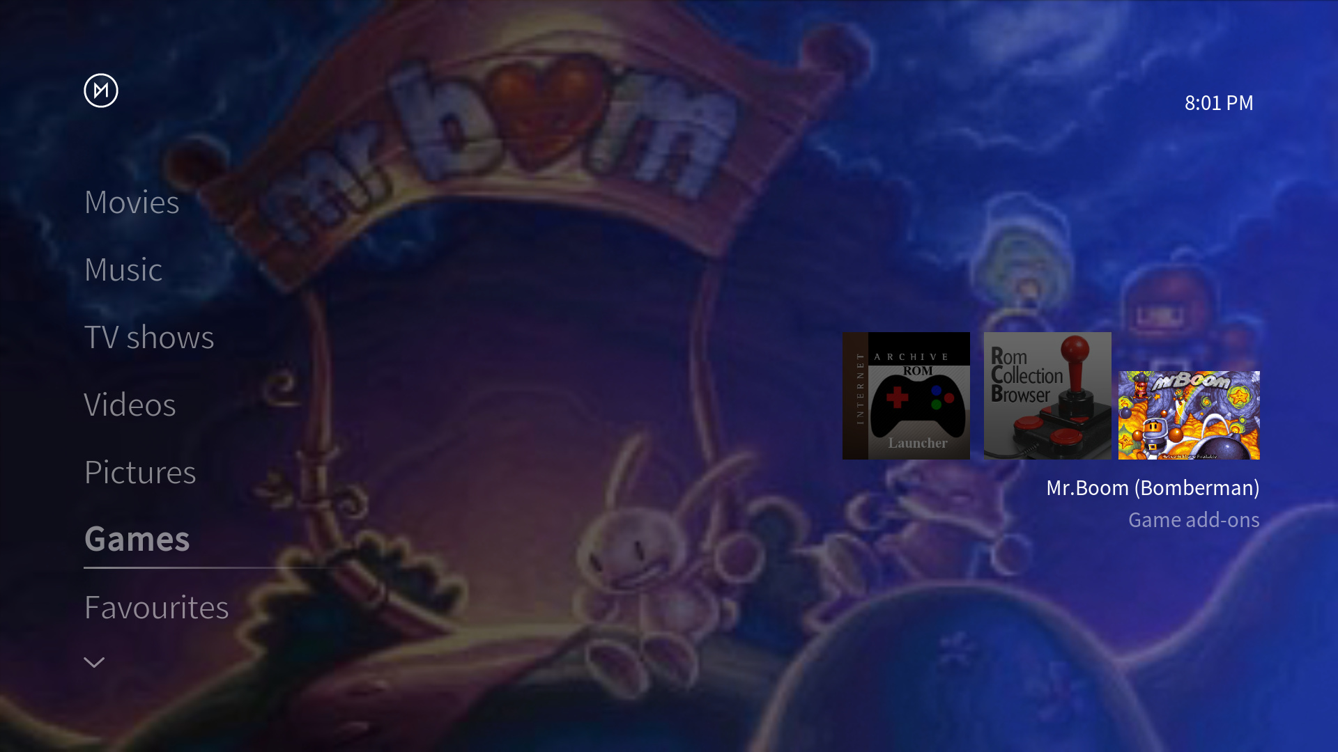
The v18 gaming section

The release of Kodi v18 brings retrogaming to OSMC users. This obviously requires a new games section for our OSMC skin as well.

This is how the new games section looks in our home menu - including a new default game add-ons widget:

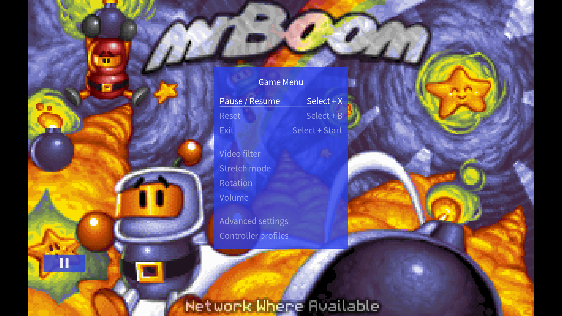
The OSD that pops up when pausing a game:


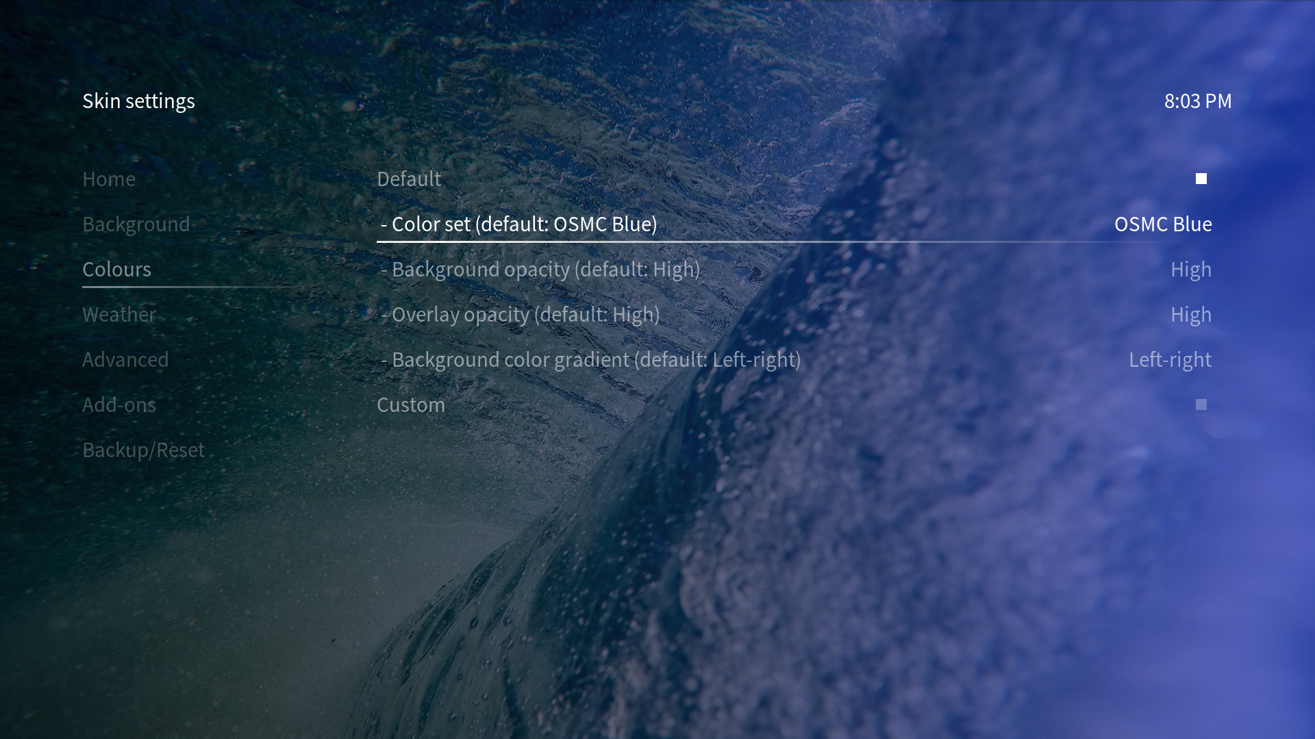
All new color options

Here you can see the new color options in our skin settings (Settings/Interface/Skin/- Configure skin…/Colours). It allows you to set pre-configured color sets with matching background, overlay and text colors. This should give you good customisability while keeping a clean look. You can also adjust the opacity of the background as well as the overlay color. Additionally, you can set how the background color gradient should look. Five options are available: left-right, right-left, top-bottom, bottom-top and plain color:

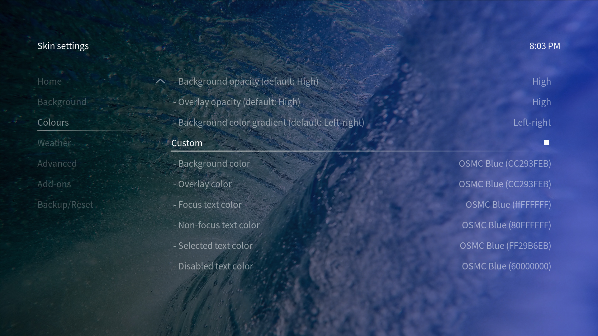
If this is not enough, we have some new custom color options that let you set background, overlay and text color the way you prefer:


Last, but not least: new sub-menu indicators

We try to keep the OSMC skin’s look clean and simple. To achieve this, we’ve always hidden sub-menus and context menus outside of the screen as long as they’re not opened. Now, we’ve added indicators that show you, if a such a sub-menu is available. The direction of the arrow visible in the following screenshots indicate which remote key you have to press to open the sub-menu:


And our v18 OSMC skin changelog

New

  • add new v18 subtitle settings OSD during fullscreen video playback
  • add new games section to match v18 requirements
  • add new resolution select button/dialog in video player
  • add player icon to now playing dialog
  • add new dependency button in addon info dialog to match v18 requirements
  • new color options (color sets, background gradients, adjustable opacity)
  • add PVR channel number input dialog
  • add PVR timeshift status dialog
  • add welcome dialog on non-OSMC devices
  • add director button to video info dialog
  • add new views (wide low, wall small, wall low, wall info, list info)
  • add new sub-menu indicator icon
  • add “Random TV shows” widget as new standard for TV shows home menu entry
  • add new dialog navigation indicators

Improved

  • adjust syntax, values, labels and infobools to match v18 requirements
  • adjust PVR section to match v18 requirements
  • highlighting color now adjusts according to text color
  • streamline OSD animations
  • add missing adjustable plot fonts
  • let favourites dialog behave like a normal window
  • add file path and name to refresh button in video info dialog
  • add song/album year to music player
  • add wide list as music view
  • add music OSD album art size switch
  • adjust widget headings to always show and adjust animations to match widget animations
  • add option to change widget labels

Fixed

  • show proper game widget title when not using skinshortcuts script
  • highlighting is now more consistent
  • fix current position/time remaining and current time/end time for PVR playback
  • hide deprecated previous/next channel buttons in PVR playback OSD
  • fix background of subtitle settings window
  • fix layout of PVR playback dialogs
  • fix dialog list navigation
  • change font size of media tags to prevent overlap with titles/details

For a more detailed changelog see here: OSMC skin changelog


Hopefully, we could add some nice features for you that you’ll like. Feel free to leave some feedback! We’re also always open to new ideas for our skin… So, please do comment, if there’s anything you’d like us to add (we’ll take a note and might add it). :slightly_smiling_face:

Enjoy!

9 Likes

Hi there, just updated my Vero 4K+ and I’m using the OSMC skin and so far it’s great. Is there a way of changing the background photo from that wave to some photo from my library?
Thanks!

In the skin settings under Background.

I have the games section in estuary only but not in osmc skin… I don’t see it in the customize home menu section either. . Is there a way to enable it in osmc skin?

It should be there by default when updating to our April update - and if home menu customisation isn’t enabled.

If you’re using home menu customisation, please select Restore menu items in the customise home menu dialog. There you should see Games.
This can happen, if customisation settings are carried over from v17.6 where the games section didn’t exist.

2 Likes

That’s it. Thank you! :+1:

2 Likes

I’d like to see the option for a simple ‘dark mode’. Black background, white text.

You can do that yourself with the custom color options… Simply adjust the background, dialog and text color to your liking. :slightly_smiling_face:

1 Like

Please also make option for default view. Like I would like to have list-info as default for all. Thx!

This sounds really nice. I’m currently using Rapier but have 1 question before I make the switch.
Can this display movie or show logo and clear art etc instead of text?
I realize this adds to how heavy the skin will be but figured I’d ask since I’d prefer to use the skin designed for this box.
I currently use artwork beef as an add on to grab additional fanart, logos etc.

We don’t support clear art, but only text for titles. There are no plans to change this.

Great work folks!

A single quibble, first boot up the new Random Movies widget popped up some horror movies… In a house of little children. I’ve spent the last hour failing in disabling the random movies. A spot of help would be lovely.
(also, hi Sam!)

Edit: Ask and you will discover…
**settings → interface → Configure skin → Customize Home Menu → Movies - Manage widgets → Select widget → Video Library → Movies →
Enable, disable, delete.
Now, all gone :slight_smile:

2 Likes

Great work with the skin, after April update I tried many of the newer v18 Leia skins but nothing is as comfortable to me like OSMC original. The only thing I would like to enable, somehow, are more options for ratings of the movies. I would like the skin to “show me” which rating I am currently seeing. Maybe a small logo of TMDb or IMDb near rating? Also, more options for ratings at once, with metacritic, rotten tomatoes, imdb. I know there are no public APIs for some of the providers, but can it be done with Universal Movie Scraper and OMDb API key? I would really really like to see this if possible. Thanks!

1 Like

Here’s an idea for more ratings to show up. I’m thinking of adding a new, second info screen to the video info dialog which also has all ratings:

The More… button brings you to the second screen:

Which offers ratings, audio and subtitle information as well as a bigger plot text which has been requested:

The second info screen supports basic ratings information as well as IMDb, TVDb, Rotten Tomatoes and Metacritic which are provided by the universal media scraper.

Personally, I am not a fan of adding ratings on the second info screen. I think we should find space for them on the main screen and try to group together relevant info in segments:

First group:

Name of the movie • Year • Duration • Rating

Second group:

Director
Writer
Cast
Genre
MPAA rating

Third group:

Resolution
Audio
Subtitles

Forth:

Short movie info, as short as possible. (Longer can be on the second screen if the user wants it)

I am not skilled enough to do this in photoshop, but I think we have enough screen space to do this if we use the row with the Movie name for the first group and then move right of the poster for the rest, somehow. Right now, duration info is definitely misplaced, it should be easier to see, closer to the name of the movie, above or beneath the poster somewhere…

I am not plex user, but i Googled it now just to see how they did it, and they are close to what I had in mind for our movie info screen:

The movie row on top is a standardised row which is always the heading of a page… It only shows the title of a movie, album, artist, TV show, directory etc. Nothing else. So, I won’t put any other information in there.

We don’t have enough space for all of these information on the first page, I’m sorry. Spacing has to be kept in mind and the fonts can’t be made any smaller - some people already think everything’s too small now as it is. The Plex design has a completely different design guide in the background and has obviously chosen to make fonts really small - too small for a TV setup IMHO.
Another reason: fonts are also standardised. They shouldn’t vary in size all over the skin. :wink:

More than one rating information is qualifying as “More information” IMHO. That’s the idea behind the approach. The same applies to more than the first audio stream and the subtitles streams.

But this shouldn’t be understood as: No, won’t change anything. Just outlining the ideas and thoughts behind the layout. Will think about how it could possibly be done again :+1:t2:

1 Like

So, having added a basic rating field and the audio information you also get from the media flags to the info dialog:

And the second screen then shows extended information for ratings, audio, subtitles and plot: