Hi there,
We’ve been working on some skin improvements that will hopefully address issues that have been reported on the forum. There’s also something to test for those already using our Kodi v18 alpha test builds.
The new features are available in the newest OSMC v18 alpha builds (Vero 2/4k builds and RPi builds) as of now and they’ll be available for v17 users in our staging repository. For instructions as to how you can switch to staging, please read on:
- Login via the command line
- Edit the file
/etc/apt/sources.list - Add the following line:
deb http://apt.osmc.tv stretch-devel main - Run the following commands to update:
sudo apt-get update && sudo apt-get dist-upgrade && reboot - Your system should have have received the update.
We also recommend you edit /etc/apt/sources.list again and remove the line that you added after updating. This will return you to the normal update channel.
We’d appreciate feedback here under this post! ![]() The improvements will probably make their way into the next OSMC update. Thank you all for testing and leaving some feedback in advance
The improvements will probably make their way into the next OSMC update. Thank you all for testing and leaving some feedback in advance ![]()
Here are some screenshots to let you know in more detail what the improvements are…
- Highlighting
There have been complaints about poor readibility and distinguishability of focused control items (buttons, cover art items - everything one can select and press basically) and non-focused control items. There are two improvements that will be made available for testing and feedback addressing these issues:
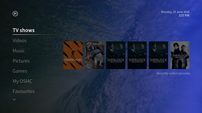
First of all, there’s text highlighting for those controls that are just buttons or text elements. Here are some example screenshots:
Home screen:
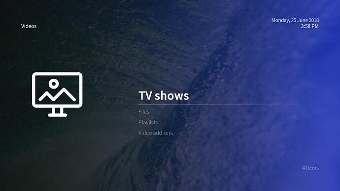
List view:
Button highlight:
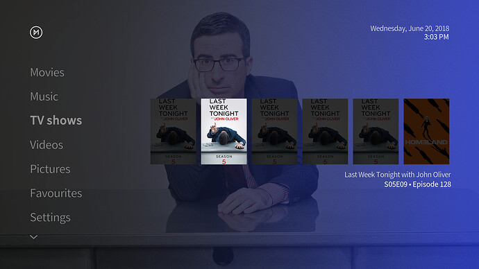
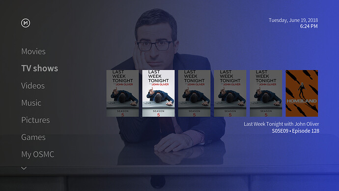
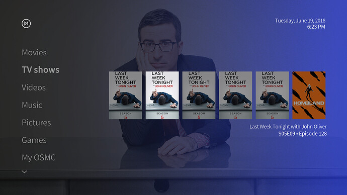
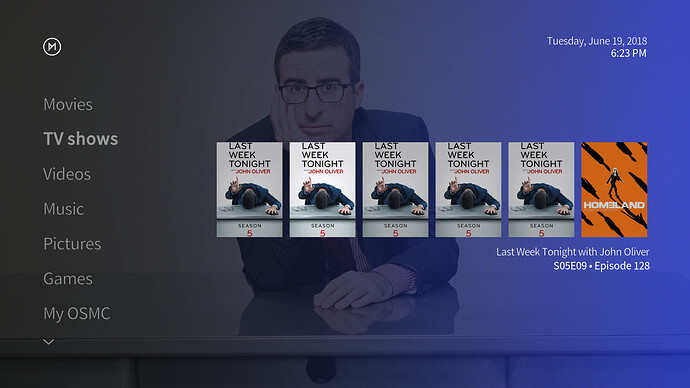
The second option we’re putting out to address visibility issues with our skin is the dimming of any art. Here are some sample screenshots that should make clear what this setting will do:
Four settings are available for dimming cover art…
133% to increase the difference as much as possible without making the unselected cover art black:
100% (default):
66% which makes unselected cover art less dark:
33% which makes it the least dark possible before there’d be no difference anymore:
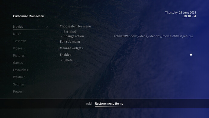
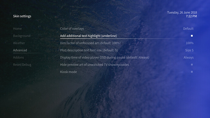
There is a settings option under the Settings → Interface → Skin → -Configure skin… → Advanced section which allows to disable the new text highlight option (for those who’d like to retain the current look of the skin). The dim factor for unselected cover art will be adjustable in the same section:
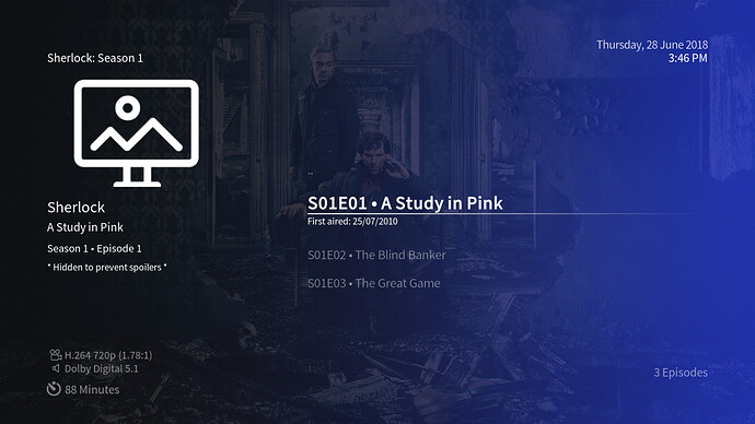
- Hiding cover/preview art of unwatched TV show episodes
This issue has been raised a few times and has been an issue discussed widely over on the Kodi forum, but a solution has never found its way into Kodi itself. For those who’d like to prevent any spoilers by cover/preview art of unwatched TV show episodes that show up in our skin, this art can be hidden now. The setting can be toggled independently of the Kodi setting to hide unwatched items’ plots. It can again be found in the Settings → Interface → Skin → -Configure skin… → Advanced section. Here’s a sample of the effect of this new setting:
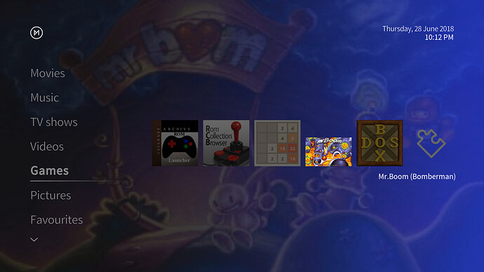
- Kodi Leia v18 skin including the new games section
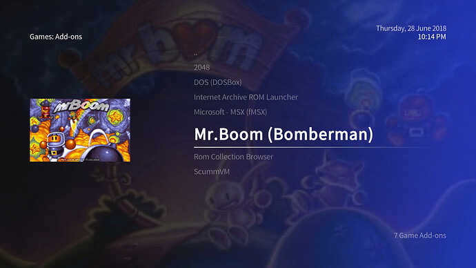
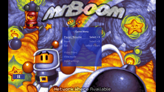
As some of you who’re already using our OSMC v18 alpha test builds might’ve noticed, the OSMC skin has been ported to work with v18 for a short while already. Now, work on the v18 compatible skin has been finalized to offer all new v18 features that are available at the moment - especially the new games section (final doesn’t mean all work is done though as Kodi v18 is still in the alpha stage). A few screenshots of what’s new:
The games section in home view:
Games add-on view:
The game OSD dialog:
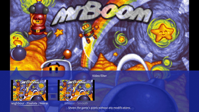
The game video filter dialog (accessible through the game OSD):
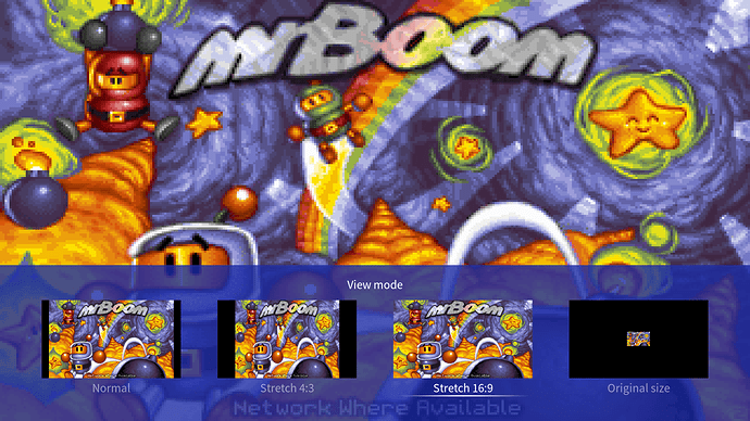
The game view mode dialog (accessible through the game OSD):
A few more improvements are a new subtitle settings dialog during video playback and a new games settings section.
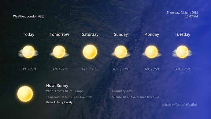
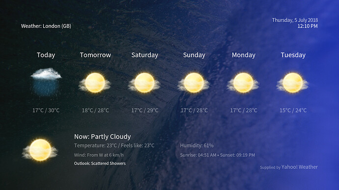
Weather section
Last, but not least: we’ve fixed the weather window which had many bugs. Here is how it looks now:
