It's been nearly five years since the last big change to the OSMC Skin and with our next update which will introduce Kodi v19 (codename Matrix) and our new video stack, we'd like to introduce some design changes to the OSMC skin.
This is a companion discussion topic for the original entry at https://osmc.tv/2021/08/the-osmc-skin-redesign-2/
1 Like
I’m not a fan of the new left side overlay when browsing my movies in List view.
I tried changing the transparency but no matter what I do it introduces banding.
Would love for an option to set transparency to 0 or for the skin to not draw it at all (or maybe an HDR skin).
Otherwise things look pretty nice.
Unfortunately, we can’t do anything about the way the skin engine renders skins internally. I don’t believe it’s done with 10bit bit depth and thus there can’t be HDR compatible skins atm.
This means there will always be banding in skins - it was there before with the background colour gradient and it will also be found in cover and fanart. Adding a 100% transparency setting doesn’t make much sense to us as it would be a setting completely disabling the basic design of the skin. I’ll think about whether there’s anything that can be done. But it might be wise to address this banding issue over at the Kodi forum as it’s a skin engine issue.  The underlying PNG files have 24bit bit depth which shouldn’t lead to visible banding.
This seems to be a Moire effect between the background fanart and the overlay. I don’t think it has to do with the bit-depth of the artwork - we aren’t using gradients, now, right? The shape of the banding is always the same. On my (HD) TV it’s hardly visible and only when the fanart is plain in that top-right of the left panel.
Changing the video output to 8 bits makes it easier to see and the bands are wider.
Checked with my plasma TV here which can accept 10bit video and does render colours at a bit-depth visibly higher than 8bit (less banding with 10bit input)… There’s nearly no scenario that I can spot even a bit of banding in the location you’ve posted a screen shot of This might indicate that it’s not a general skin (engine) issue, I’m afraid.
Which model and make is your TV?
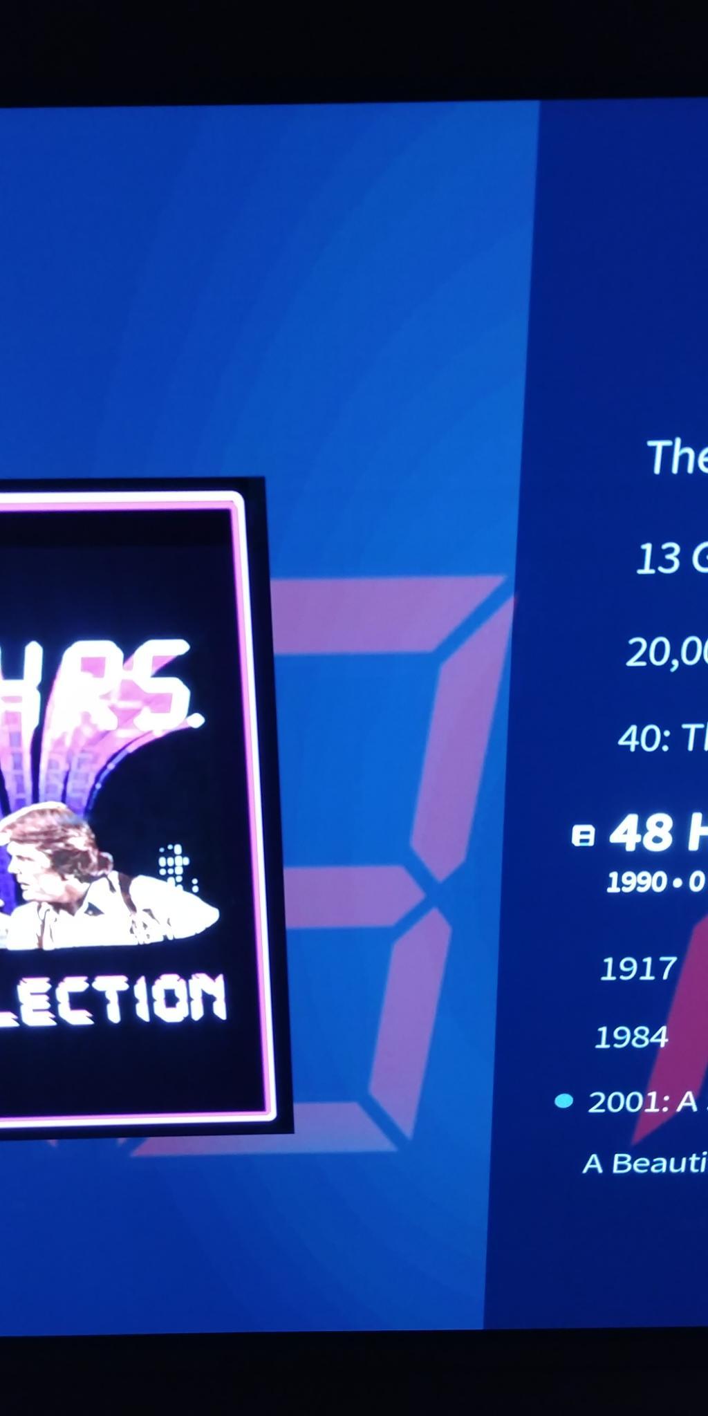
How did you manage to get the “48 HOURS” poster as fanart? Tmdb does not offer a fanart for this movie, only the poster…?
I use local images for posters and fanart.
I can upload it to TMDb if you want it.
I have an LG C8.
Yes there has been banding in the past but very subtle.
If the fanart art is plain, it is more obvious.
It is clearly worse with the new skin.
I can see it on other backgrounds as well, but I showed the 48 Hours since it was the easiest for me to capture with my cell phone.
I’ll look into taking a screenshot or something, if the Vero does that.
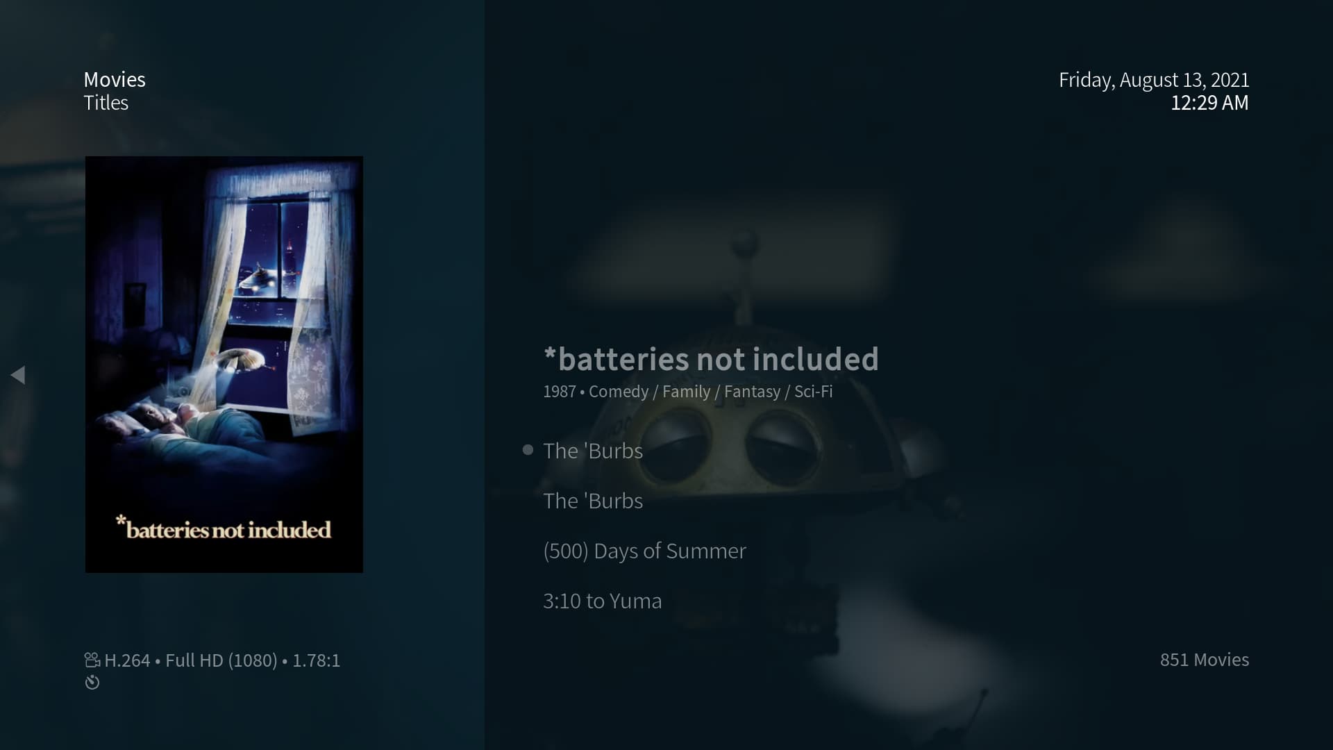
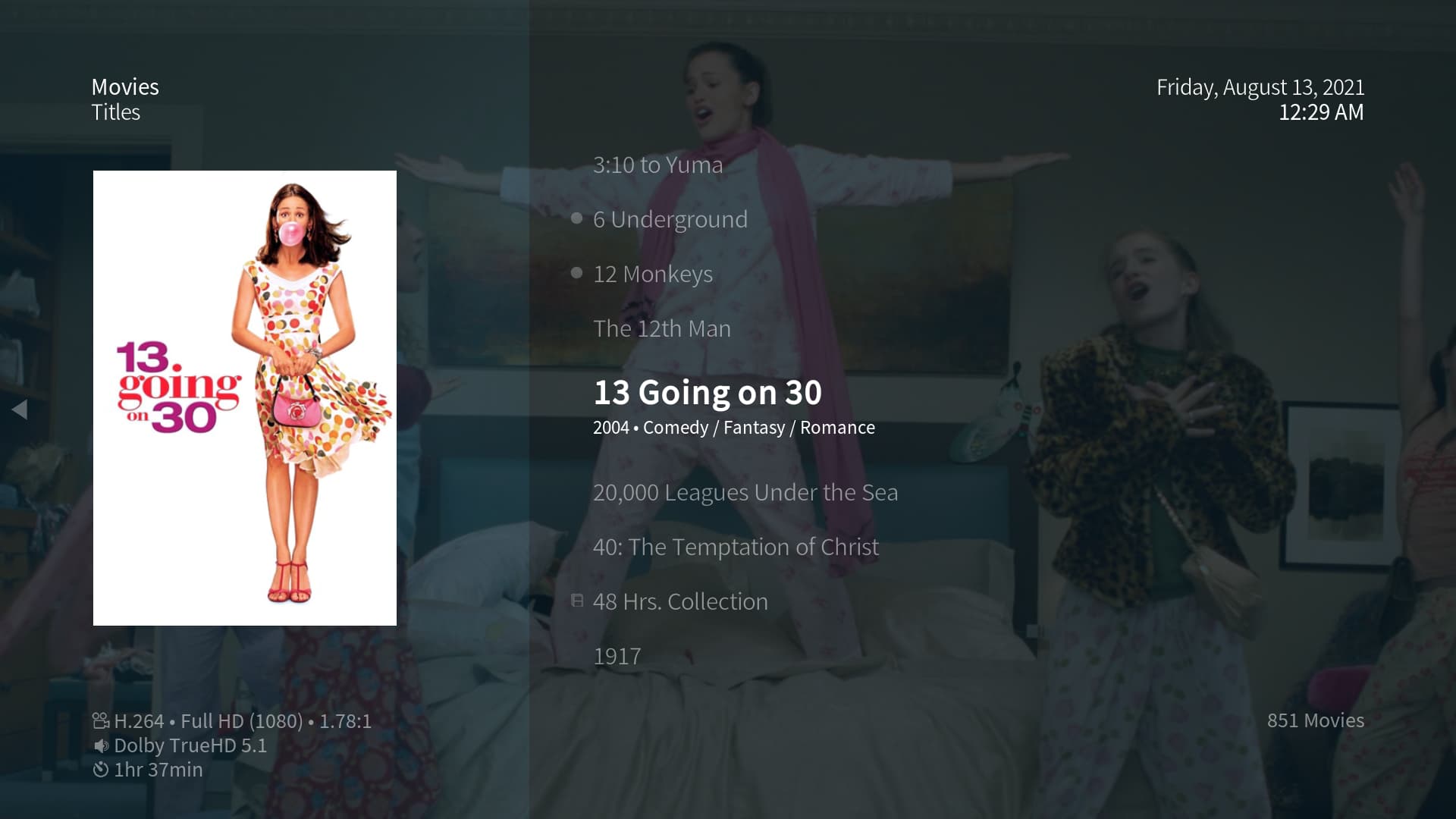
It’s more obvious on *batteries not included and 48 Hrs. because of the darker background, but even on lighter backgrounds it’s there as seen in 13 Going on 30 and 2001: A Space Odyssey.
I even took the background source file for 48 Hrs. and opened it in PhotoShop to change the levels to make obvious any subtle background noise or banding and there was some artifacts but nothing like banding or anything in the area of the left overlay.
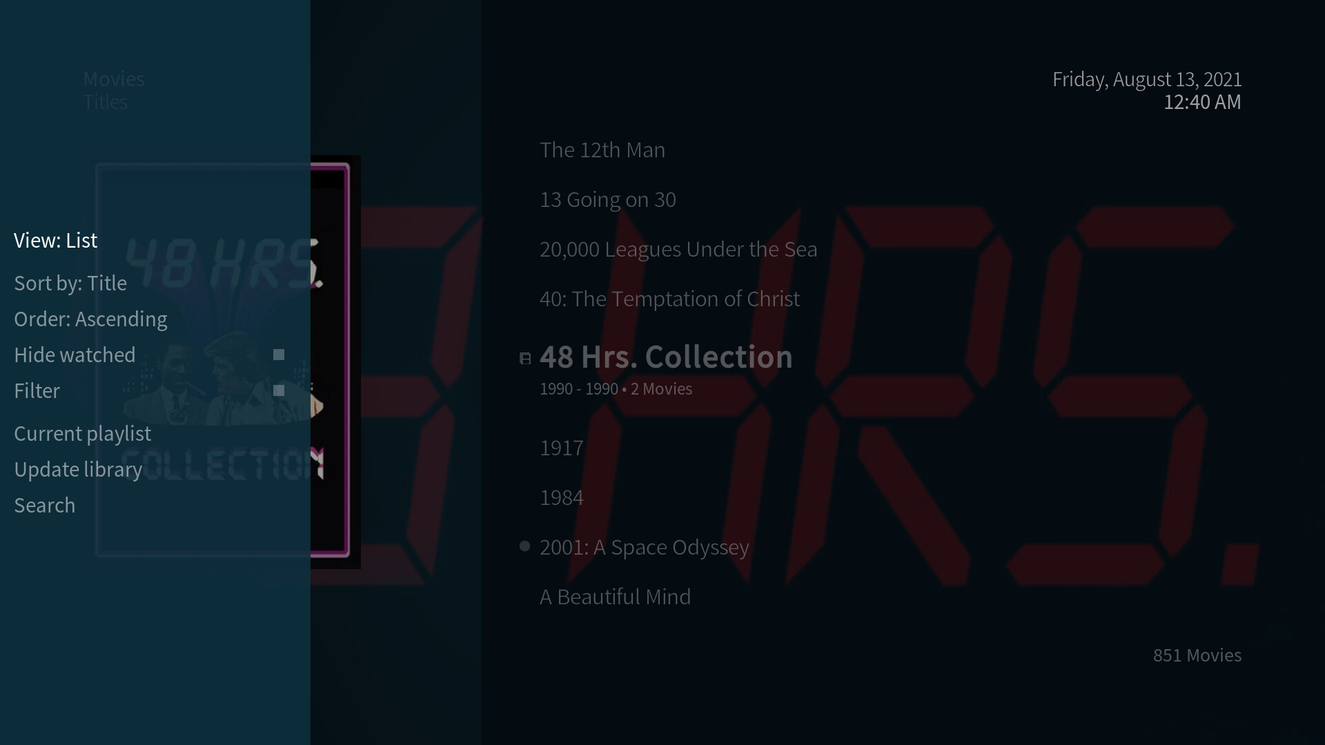
The problem is clearly just that new overlay as the sidebar option are not impacted at all.
If there’s anything else you guys want me to trouble shoot let me know but I’m pretty sure that new overlay has a low level center bloom effect that causes the banding.
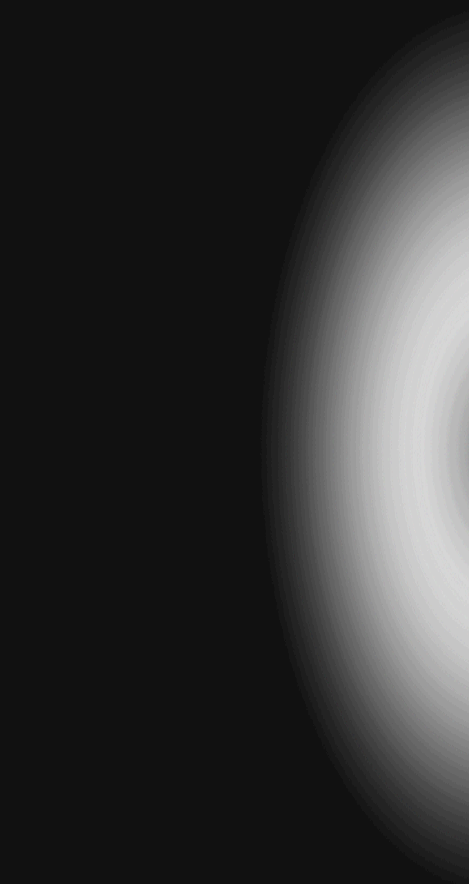
I think I found the problem file: https://github.com/osmc/skin.osmc/blob/matrix/media/common/overlayleft.png
And here it is with levels adjusted in PhotoShop to show the issue:
I’m assuming I could just replace this file with one that doesn’t have banding and the issue should go away.
I’ll test that out.
No, it wouldn’t be that simple as the textures are compressed into a special texture file for the Kodi skin engine to load quicker. What I’m still puzzled about is why this gradient is an issue for you, but not most - including other OLED users It’s a basic part of the new skin design, so I can’t simply remove it, I’m afraid.
1 Like
It has no effect on me watching movies but the new update is to bring improvements right?
I appreciate all your work truly but to be honest, the new skin looks worse than the original because of this banding, which is native to the files themselves.
So I’m just giving my feedback.
You should probably just remove the gradient from these overlay files all together and just have them flat.
No point in introducing a gradient effect if it’s not going to look good IMHO.
And the overlaybottom.png has the same issue native to the file.
I have reviewed these files on my HDR capable desktop monitor and in SDR, either way there’s banding.
Replaces these files with versions without a gradient and rebuilding the skin would fix the issue.
Or even make a transparent option with these:
But these are an eye sore:
Our skin is under constant development and we’re trying to incorporate user feedback where possible. I’ll put this on the list as promised and see in which ways the new design can and will evolve… 
For the time being, you may change the textures on your system by replacing the corresponding files and packing the whole media folder into a new Texture.xbtfile replacing the old one using this tool: https://kodi.wiki/view/TexturePacker
Thank you for considering my input @Chillbo.
I’ll have to test this out for sure!
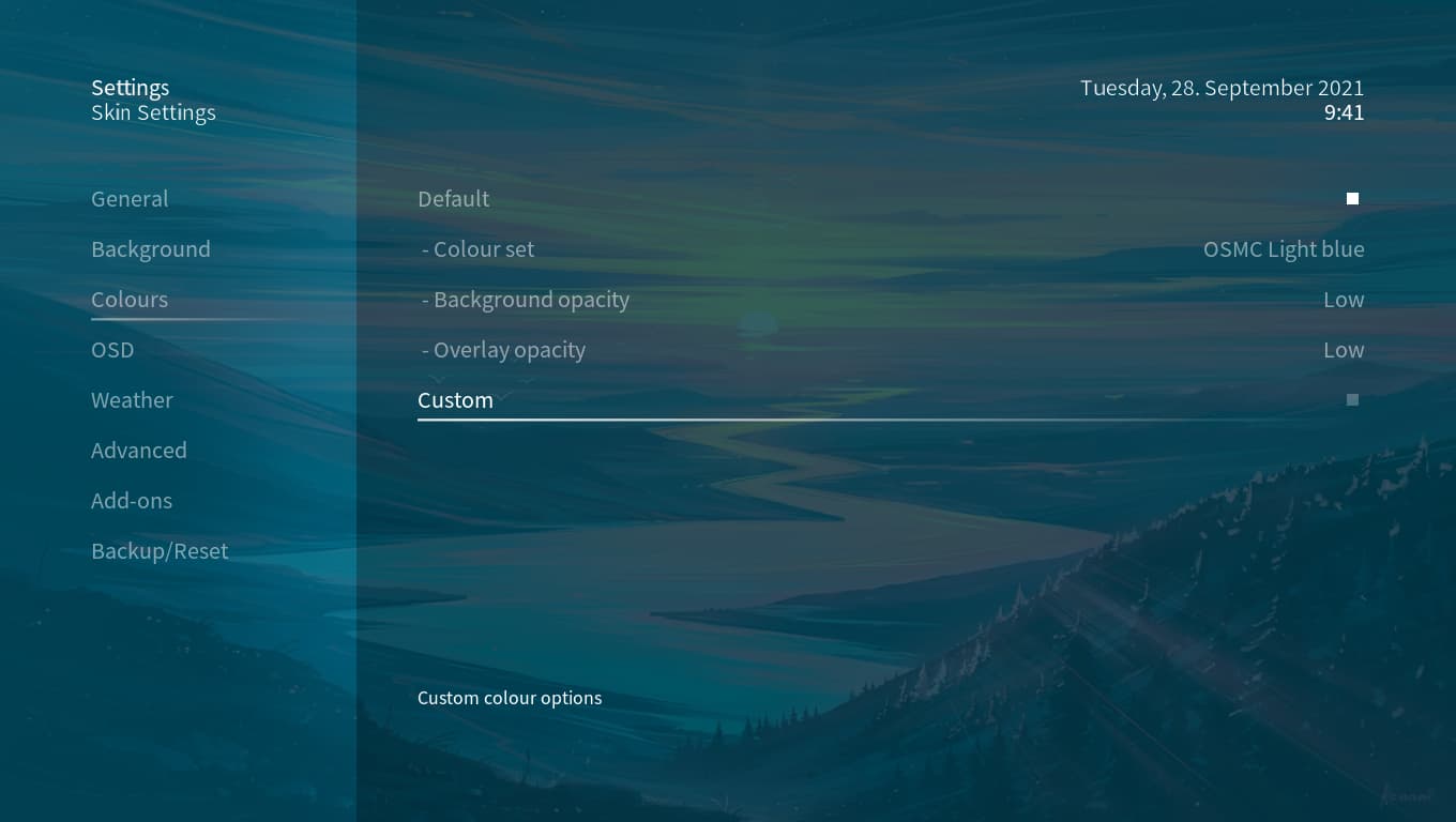
Is there any way to set background opacity to none? The most liked thing for me in the theme was a good background that is seen in most parts of Kodi UI. Now I see that ugly light blue overlay…
There is no way to do this as an overlay is needed for white text to be visible on any fanart (that could also be white). As to the “ugly light blue overlay”: That’s our new design and you may change the colour of it in the skin settings.
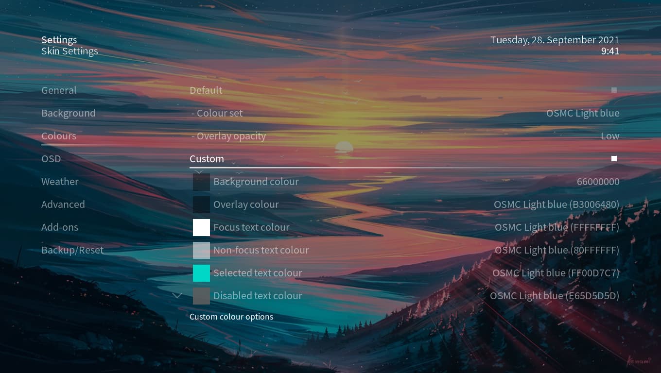
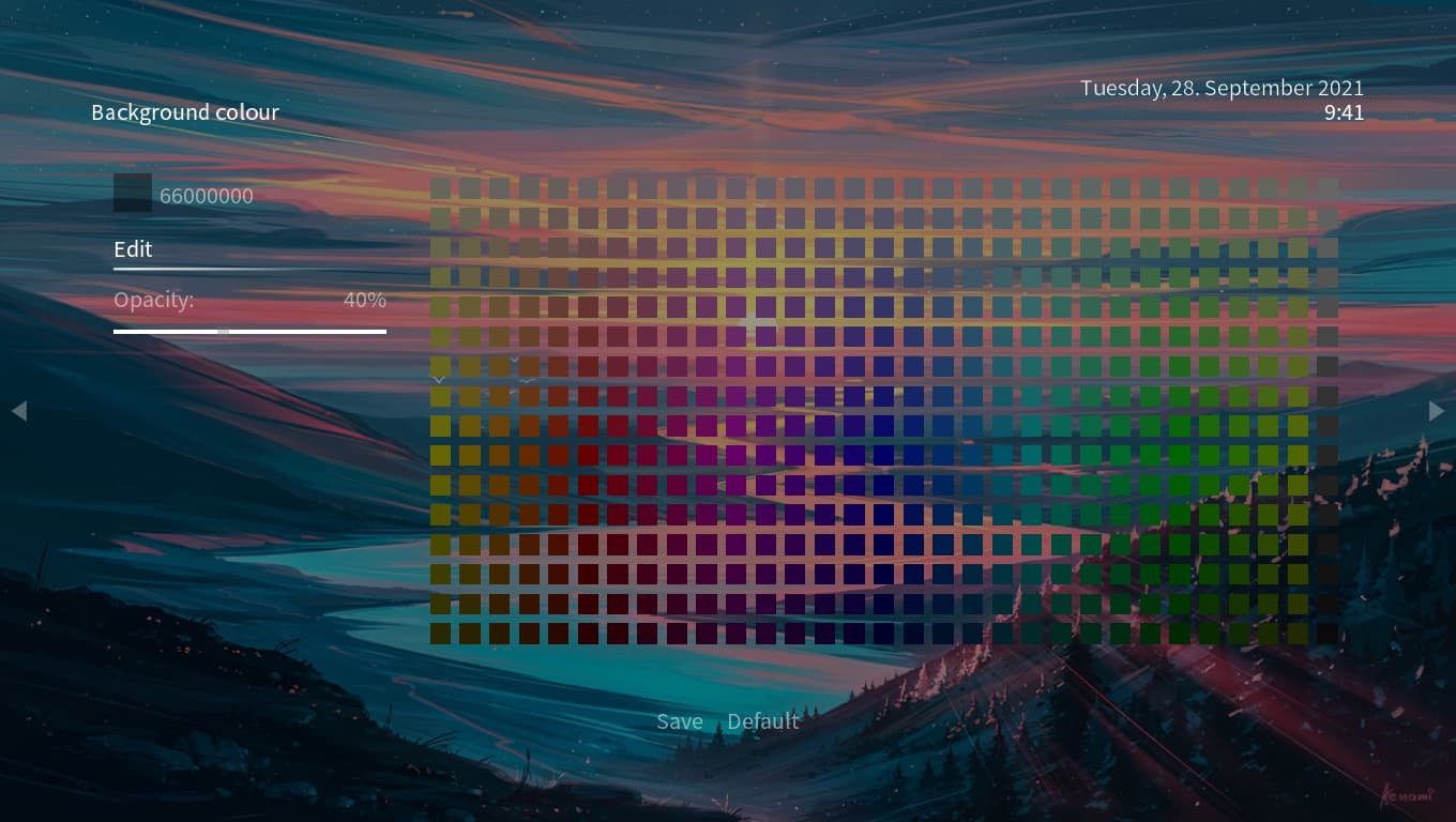
I set my background color to 66000000 to see my background properly gain
I am not a fan of this approach, let me make my own choice on wether I see the overlay or not.
The overlay bothers me much more than the few instances when I cant read the text because of a too bright background.
2 Likes
That’s what the custom settings are for… We won’t add a mode that let’s things lack basically any visibility/readability under certain scenarios. Fixed setting that we advertise are designed to work under all circumstances - that means we obviously can’t cater for all tastes from that perspective. 


