We went through a few iterations of the OSMC skin last year. While we're making it ready for Kodi 17 (Krypton), which is due in the Summer, we'd also like to improve the skin at the same time.
Truth to be told, every once in a while a switch to a new skin mainly because the eye gets bored and I want to know what else is out there in terms of skins, but rather quickly I switch back to the OSMC skin. It’s simple, it’s slick, no bloat, minimalistic and straightforward. This last iteration adds a more modern touch to it without sacrificing the simplicity…
I’m a multimedia designer by profession and, while I might have dome a few things differently here and there, nothing bears mentioning more than to compliment your design team on a job well done so far. In my view, you guys have really managed to take the best ideas from your previous skin that were already popular with your install base and mature the overall appearance into a highly polished look & feel that can represent your branding with style.
Perhaps worth considering,add multiple skins.Darker,lighter or skins with more color effects,and give the user the option to choose by using for example an skin selector
Any suggestions outside of my own personal preferences, which I believe to be meaningless in group thought such as this, would be tied to color theory in relation to psychology, particularly in the mood in which color evokes. The greens that were previously chosen invoked a cold or even ill effect at worst and a lack of fun at best. However, much of this has now been mitigated with your use of gradients to add a very pleasant and warmer blue that fully compliments the green that you have already firmly established with your brand so far.
Also, In doing this, you have subconsciously tied the user interface into the more pleasing color scheme associated with the OSMC website. Anything to further that goal is a step in the right direction in my opinion. Perhaps even adding more from that scheme in minor highlighted areas would further add to the appeal and tie your branding even closer. Maybe add a highlight or two of the warmer colors from the OSMC fractal imagery.
At the end of the day, options will always reign supreme in group projects like this. The ability to use multiple color schemes as well as background images would likely please more people if not everyone in general. As I realize that this would take considerably more work and time, I feel that I must again compliment what major improvements you guys have accomplished with this new look and feel so far. I would have no hesitation in using this skin for my own personal install as is.
It would be nice to have a dark and light theme as well as different color settings the user can select. I like reds and oranges. If possible I’d like to see the ability to either enable or disable gradients.
Also, is it possible for the OSMC skin to support CinemaVision and to disable progress and busy pop-ups on the GUI?
Looks great - really like the gradient and color scheme. Maybe also offer a dark theme as well for low-light situations. Solves my main UI beef which is the light yellow highlighted text
Thanks for all the effort over the years, as always.
Looks good Sam
But will everybody running kodi (both on PC as well as other devices) be able to install this skin ???
Or will it only be available in OSMC-form-of-kodi???
@danialbehzadi as suggested, please keep Right-to-Left languages in mind in this design.
for example:
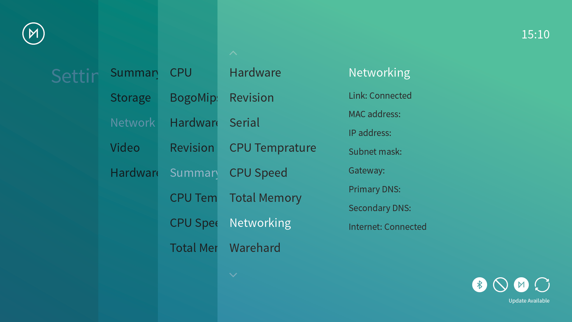
the “Settings” screenshot with the gradient based back ground in first post:
Btw: there’s a bug with the current skin: when you go to subtitles settings and try to select another language than English in the preferred subtitles DOWNLOAD language, it just doesn’t work, although it works well with the Confluence skin.
The first thing I ever did with osmc was to change the skin, this looks better. But It is down to the individual. One persons poor osmc skin is another persons skin heaven.
Its good to get feedback I voted for the photograph based background, at the moment the voting is tight maybe both should be included?