Yes the Confluence Skin is my fallback skin also.
I was not really happy with osmc skin, but before yelling like that, maybe giving some informations, why you don’t like it, and how to improve it, could be more constructive.
I’ve enabled estuary skin in settings, and it is a lot better. Really enjoy it now. And chorus 2 web interface is light years ahead what it was before. Would not go back to v16 now …
Even if I still miss a ← back and ^home button always on screen 
This is constructive.
We are happy to improve OSMC’s skin, but we need guidance ![]()
I did write a few stuff after updating that was disturbing:
I use Transparency skin, as it is what I used before OSMC and users in my house are used to it. I find that it too, loses settings when rebooted.
I also have Confluence on updated Pi1 and Pi3. No issues.
I bet if you did a fresh install of OSMC it do the same thing.
Its nice to see it being constructive. (not this post but way above) I hate it when people are like i dont like it. OKAAAYYY why? i just want it to be different … OkAAAY how? … I dont know it sucks…
How do you expect anyone to help you. And maybe i am wrong but i dont think people are getting paid alot or anything for the osmc skin. So show some respect to the creator because i know damn well you cant create a skin cause if you could you wouldn’t be bitching. So be happy to have something instead of nothing. (again not this post or KiboOst talk about above)
1 Like
I had problems, too, but after a fresh reload of OSMC, it worked fine. I prefer Confluence and it works fine with the fresh load.
Same problem with unity skin thst is based on confluence. After some restarts, wallpaper, color of skin and some more resets to their default
If you want those, just use Estouchy. Personally, I don’t like Confluence and the nice, clean OSMC skin was my main reason to come here from OE. But Estuary has now leap-frogged OSMC IMHO so I use that and Estouchy on all devices.
Hi Sam and Skin Designers,
because I’m waiting for the ‘some settings lost some times’ bug update, I gave the default Skin one more try in my house. So here are the comments of me and my family:
Coloring
- white (default text) and yellow (selected text) are hard to differentiate on a bright spring day, when the window blinds are not down
- same at the large TV in the living room, at > 5 meters distance
- very same for all 45+ age people
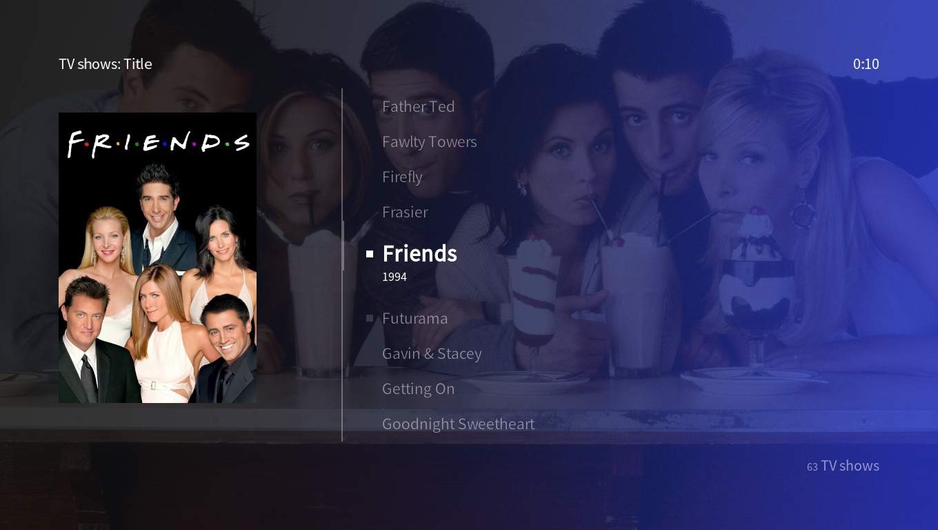
- Better readable is “confluence” skin: blue colored selected text in good contrast to very dark gray background + plus very light gray unselected text color in the main menu-bar. In Listings, the text color is always light gray, but the selection receives an “selector” rectangle with contrasting background.
conclusion: If one had a more contrasting color, or if the difference to white is more intense, one could read it very much better
Style of Checkboxes
- it is hard to remember and understand, if a check-box is selected or unselected and if there is a 3rd state or not
conclusion: seeing a red ‘x’ for a no, a green ‘v’-shaped hook for a yes and an empty square for not yet decided would be more helpful
Organisation
- after 3 years of using confluence, it is not easy to learn the new structure, at least for 45+ age people
- the new structure is clear and simple
That’s from my family and me.
Ehm, wait, my wife wat to type some:
Dear Mr. Programmer,
please keep in mind humans who already need to wear reading Glasses. We can not wear Glasses while watching Movies from Distance. We also need a Design we can read without our Glasses.
Cheers,
Mrs. 'Laser Man"
okay, I can not add anything here,
thank you for taking time!
Laser Man