Beautiful skin! Looks very neat.
First minor issue I noticed: the overlay notification (for example “mounted removable storage ‘name of device’”) is too small, I am only able to read “mounted removable”, by the time it starts scrolling, the notification disappears.
This could be an issue when the notification states an error: you might not be able to read what causes the error.
Another issue for me: TV Shows> Fanart viewtype: the text of the tv show titles is too tiny, a bigger font would make it much better readable.
and a little feature request: the ability to use a folder containing photos (from the Pictures library) as background (perhaps only when not inside Movies or TV Shows or Music Videos sections).
Yesterday I upgraded to the latest Krypton Beta build for the first time (straight from stable OSMC) - Kodi 17 Beta7 came up with it’s new estuary skin, for some reason OSMC skin was not taken up.
Also, Kodi hang in “Migrating addons to the new version for hours”.
After a reboot, the system loaded with Kodi’s estuary sking and showed an error message “The addon MyOSMC is not compatible with Kodi 17 and has been disabled” (??)
First I manually changed the Skin to OSMC, that seems to be working OK.
Then I manually enabled the MyOSMC addon, it seems to work, it shows a circular interface with the familiar OSMC icons but with the old blue background, and the version shown is OSMC December 2016 2016.12-1, it doesn’t integrate well with the skin at all. Is this OK or for some reason the OSMC addon didn’t get updated?
The latest version is the December version so that is fine. The My OSMC interface is skin independent, to make sure that it looks the same regardless of the chosen skin.
It will get a visual refresh soon enough, but not in time for Krypton
I have just installed the beta and put the OSMC skin on. Its all working well so far except for the skin menu options.
I customised the menu system in the skin settings and now the menu options don’t show up. I have even gone into the settings and tried to re make the menus I wanted but it still doesn’t work. Anyone else having this problem?
To get a better understanding of the problem you are experiencing we need more information from you. The best way to get this information is for you to upload some logs. You can learn more about how to submit a useful support request here.
Thanks for your understanding. We hope that we can help you get up and running again shortly.
Press left button. All submenus go left now rather than right and are hidden while on the main gui. If this works you can also map the ok button to go left. Let me know and I’ll look up the command
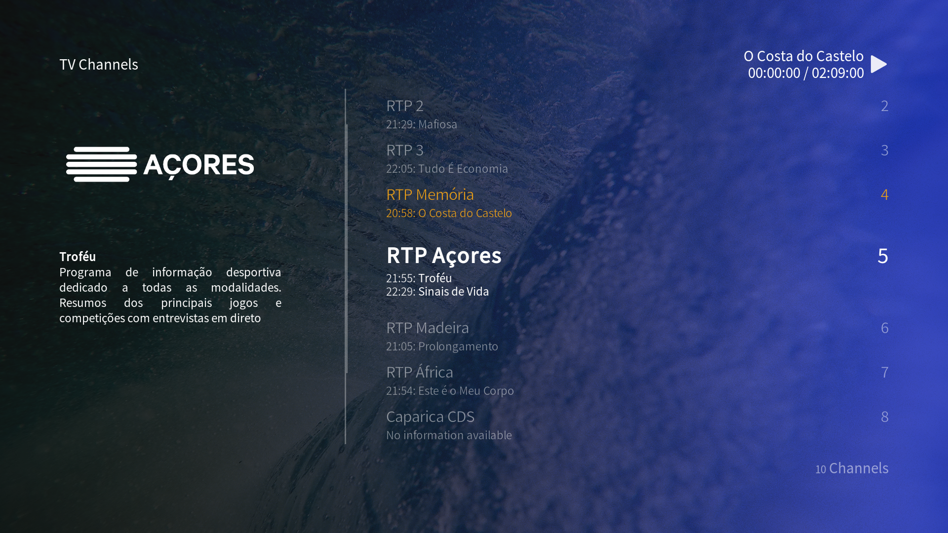
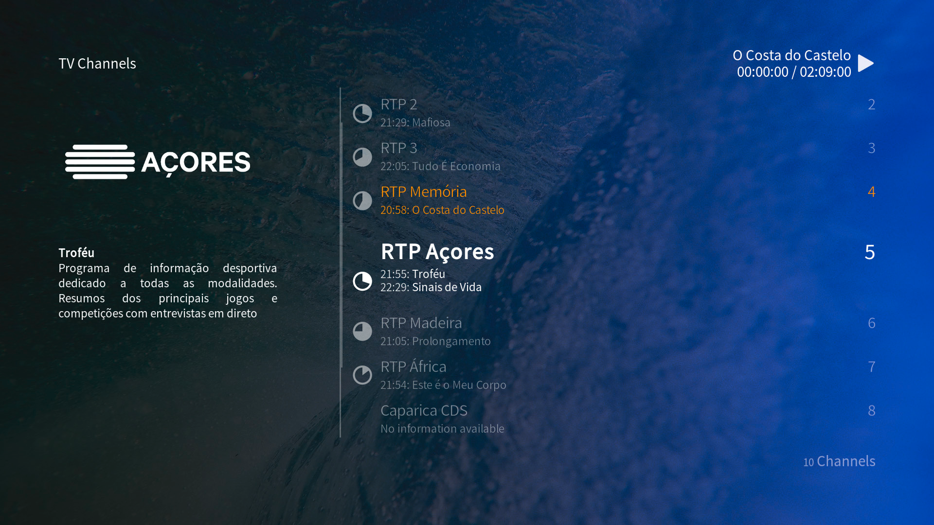
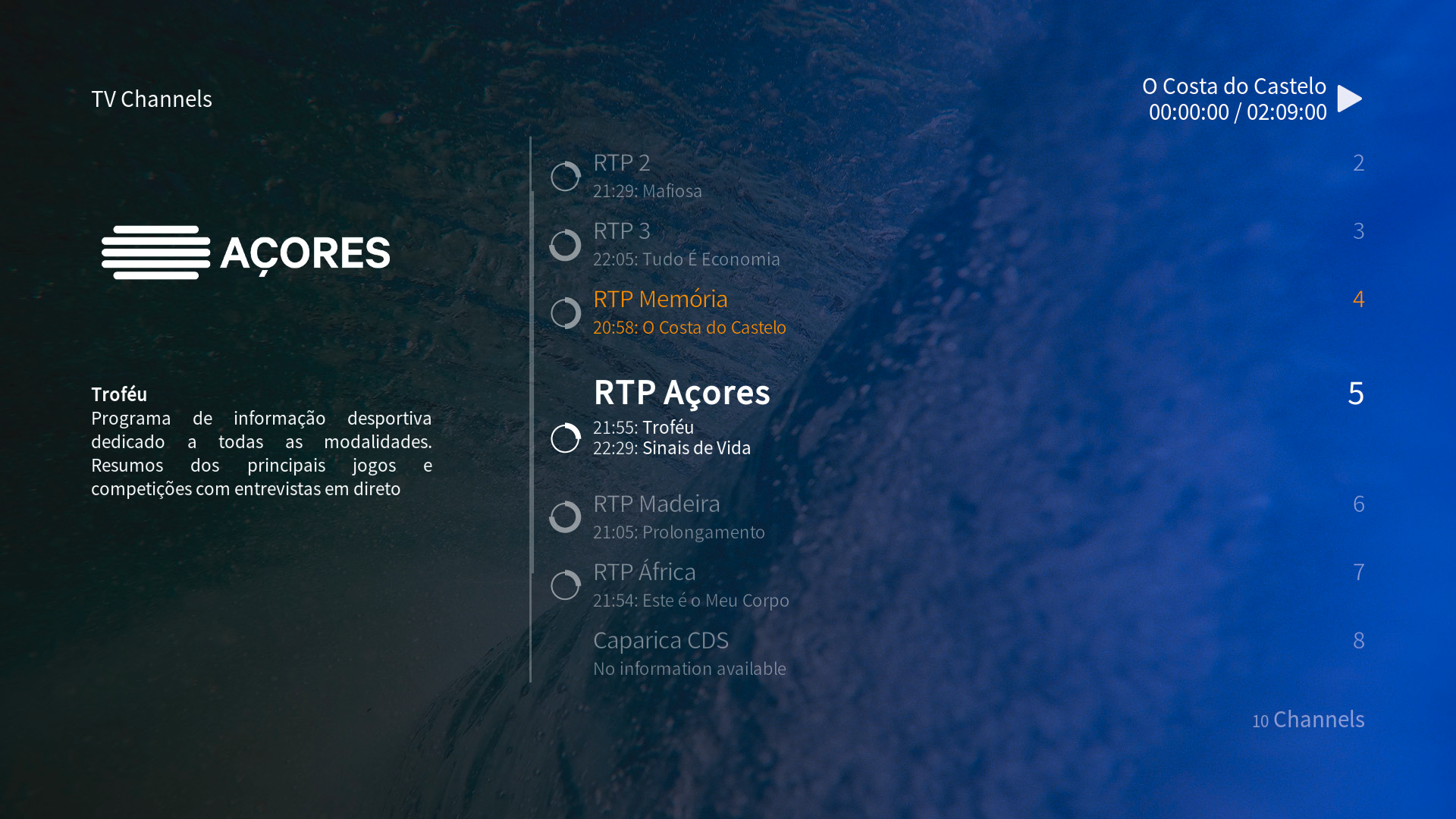
Just noticed something else, the progress bar that showed if the current tv show was at the beginning, middle or end is now gone. The time next to the current and next shows are useful but it’s just not as fast to tell.
On the other hand, I think it looks great like this. Maybe a pie chart next to the name of the channel/show could bring the progress back while still looking this clean.
I really should’ve tested and suggested this stuff earlier…
The yellow/orange/golden also seems out of place in this menu, maybe keeping it white and bold to show that it’s selected is enough. Since the “scrolling selection” is bigger and centered on the screen I’d say it wouldn’t bring up any confusion.
And on a more personal note, the time not being always visible on the main menu when watching something is a bummer.
But this could be just me, since I don’t wear a watch and don’t have another one on my living room (apart from the computer and phone). It was just handy to hit back to see the time.