Wow… I read ‘lonely colon’ and thought I’d really hate to see what comes outta that skin… Crappy joke that
Seek help Chris
2 Likes
http://paste.osmc.io/uhinekemid
This is the last log after testing again with updates installed
Unfortunately there is very little useful information to me in the log as Kodi’s debug logging option wasn’t enabled before the crash (I presume you’re still getting the crash?) was reproduced.
Please have a read of the wiki for details of how to enable the necessary option: How to submit a useful support request - General - OSMC
After testing a bit I found one bug with the new skin:
- Luna(moonlight launcher) addon shows an empty game list followed by a error. This works fine in estuary
Also, there are two things that could be improved in my opinion:
- Notification screens when in playback of a video are always visible. For example, on other skins, the status of a streaming torrent only shows up when pausing a video. On Osmc skin It’s always visible on the top right corner.
- On Estuary during playback it’s possible to toggle subtitles on the fly withouth accessing the subtitle selection menu. On osmc we can only access the full menu.
Thanks for the feedback.
Luna has some code with ‘patches’ the skin but it’s expecting to find the Jarvis-era skin and not the Krypton, so it’s possible this will have to be fixed in Luna. If you post a debug log, though, I’ll check to ensure it’s not a skin issue.
I suspect this is a change in Kodi behaviour as, from a quick test, notifications show up when watching full screen video for me in Estuary.
Added to my to-look at list ![]()
Thanks for the help!
here’s the logset for the luna error:
http://paste.osmc.io/bajuwiloye
With osmc’s new skin it shows an empty game list. On estuary it works ok
Thanks for the log. There’s no luna or skin errors shown there. I’ll try and find some time to have a play with luna directly but whilst they’re patching the skin (with the patches aimed at the old OSMC skin at that) I have to assume that it’s their issue.
Hello!
I upgraded to the Krypton beta to test the new skin, but it’s far different from the design i saw in here: We're designing a new look and feel for OSMC - #74 by fzinken
That looks great, I love the tab desing, it’s very neat and functional. What happened to this? Is there any reason why we are not testing this design? Would love to help with that.
Maybe someone could clear my doubts ![]()
Thank you all so much!!
We changed direction with the skin.
The initial March post was only a proof of concept.
Cheers
Sam
You mentioned feedback on brightness. I read you’ve changed the direction of the skin, but I feel now the background appears too dull. I’m not sure if it’s possible to have a way for users to adjust brightness on backgrounds included or not, but that would be ideal. If not, it would be nice to have the brightness increased to see a bit more detail on the backgrounds. Other than that the brightness of the skin seems to be good elsewhere.
Without going too much into the details, it’s not easy to adjust the brightness of the backgrounds as this is determined by the overlay image we use which is itself a technical marvel using halftone images. However, I’ll make sure Simon - our graphics designer - is aware of your feedback.
Just to be clear on what you’re saying, you believe that the background images (the OSMC water images, the fanart?) aren’t bright enough? That is to say more detail from them should be displayed or something else? However, as Sam has previously said, we’re unlikely to be able to create something that is perfect for every user, so any other opinions on this are very welcome.
Note that this is different from the previous feedback we’ve received on the backgrounds which was suggesting that the blue colour we overlay on the background images to the right is too bright.
1 Like
Alright I get what you’re saying and that makes much more sense. I can see how the blue is a bit bright, but I would also say the overlay just in general is a bit strong and drowns out too much of the background making it difficult to see. I hope that helps out.
I like the tinted affect though, I think it’ll be really nice looking when you guys get it balanced. I’m also amazed by the readiness of your teams responses.
I’m having this same issue and I think I can upload a log file for it.
I just updated OSMC from the latest stable release to the latest Krypton beta build, and then enabled the new skin, which seems like another exciting step forward – congrats!
For what it’s worth, I had a few teething issues that weren’t resolved by reboots:
- None of my widgets (carried over from my old settings, though not non-defaults, I think) worked until I went into the skin settings and set them up again. After doing the first one, I ended up deciding to revert the skin to default settings, as the only real customisation I make is having fewer home menu entries.
- Doing this, I discovered that Settings>Interface>Skin>Configure Skin>Backup/Reset>Reset all skin settings doesn’t seem to do anything. “Reset all menu items”, however, did the job and got all the widgets back up and running.
- Customising the home menu entries (using disable rather than delete), didn’t seem to trigger a rebuild of the menu. It fixed itself on reboot, though the menu seems to get built quite late in the start-up process, so it loaded with the old entries and then fixed itself on rebuilding 10 secs later.
On the aesthetic front, I had a couple of minimal observations, but I hope they don’t detract from the overall sense of two thumbs up and pats on the back:
- I use a projector, which means I don’t lose any of the image to TV borders and so on. In this instance, however, it means I see a very thin blue strip on the leftmost side of the screen. After rebooting to rebuild the home menu, it went away (I only have 5 home menu entries, if that’s of any help at all).
- I guess there’s a tension with the widgets between displaying as many entries as possible and having big, splashy keyart for those entries. For my tastes, I’d prefer larger artwork without having to zoom the interface as a whole, even if that means the widget makes fewer items visible in its horizontal view. Is there any way to customise this?
- I’m assuming that highlights are vital in showing the user what’s actively selected, and this skin certainly feels better in that regard than the last one. Unfortunately, it seems to have come at the cost of the widget thumbnails feeling awfully dark and muted (to the point of making them harder to parse) when unselected.
- I use the ‘recently added’ views on my widgets (which I believe is the default). There’s now an inscrutable large white dot in the bottom righthand corner of what I assume are episodes I’ve watched. I’m not a fan of these aesthetically, especially as the bright white only serves to exacerbate the previous issue of the muted colours on unselected items.
Hope that’s of some use, and sorry if any of these fall into the Kodi not OSMC category of issues. In the mean time I shall happily continue using the skin and look forward to the eventual release!
Thanks for the feedback. I won’t address every point below, but be assured we’re taking all feedback on board in attempting a create a skin which works well for the majority of users.
Widgets won’t carry over, as the new skin has a completely different widget system behind the scenes. It’s also worth noting it’s since been updated further on git, though I don’t believe these changes are ‘live’ as yet, which will require setting up widgets again. (One of the side effects of testing, I’m afraid ;))
These do two different things - the first will reset everything but the menu, the second resets the menu. If the first isn’t working, that is a Kodi issue.
I thought I’d fixed the disable-not-triggering-rebuild in the recent update to the Skin Shortcuts script, but I’ll add it to my to-look-at list for that script.
The blue line is most likely the submenu which is hidden just off-screen. If you’re seeing it, its most likely your have a little bit of overscan.
I’ve reviewed the Skin Shortcuts script code and double-checked that this is working correctly for me. If you’re able to reproduce I’d appreciate it if you could post a debug log with the Skin Shortcuts scripts own debug logging option enabled in addition to Kodi’s (you can get to its settings through Skin Settings > Add-ons and clicking on Skin Shortcuts to enable its logging option, and be sure to click ‘OK’ to save the setting) in the relevant thread on the Kodi forum.
Please make sure to reproduce the issue once all debug logging options are enabled, which is to say enable/disable an item in the menu management dialog, then return to the home screen - that will tell me why the script is or isn’t re-building the menu.
Sorry for the delayed response, but I’ve finally gotten around to testing this out properly and think I know what’s going on. If I follow the steps you outlined, it all works as expected and the menu rebuilds after selecting OK. However, it seems that you don’t need to select OK for the enable/disable state of menu items to be stored. So if you enable/disable and then press Home, the change won’t actually take effect until a rebuild is triggered independently (in my case by rebooting). I don’t know if that’s expected behaviour, but if not, I hope that helps to nail it down.
It’s also worth noting that jiggering around with adding and removing things from the menu — seemingly with reboot>rebuild method above — produces the 1 pixel (-ish) shift of the background to the right revealing the thin blue bar at the left of the screen, as mentioned in my earlier post. I’m not sure I have it down to a reproducible art yet, but rebooting a second time seems to fix it.
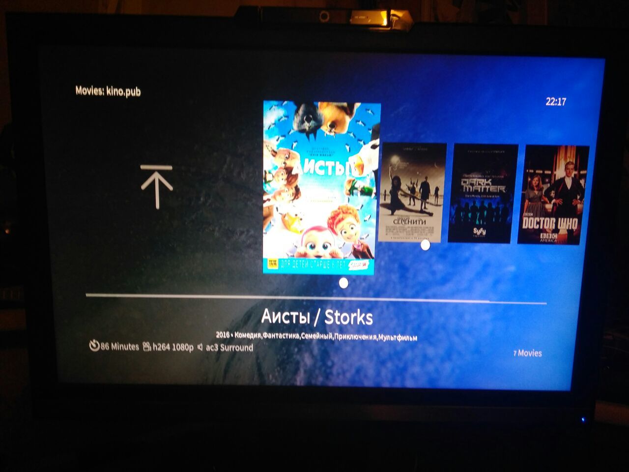
Hi!
Watching progress is shown with wrong representation (white circle). However I’m not shure if it’s a theme bug as it is related to video plugin (kino.pub).
Sorry, I missed this post.
I’ve been unable to reproduce the issues you mention with enabling/disabling menu items. This is an issue with the Skin Shortcuts script, so really needs to be dealt with on the Kodi forums in the thread I linked to before - though it will still be me dealing with it (probably not quickly, given the time of year), it’s not a skin issue so isn’t relevant to this thread. As I requested, please post a debug log in that thread - I require a debug log for all issues in that thread as it’s not a general support thread, and it will also give me the information I need to work out whats going wrong as I previously described ![]()
(Just for general information the ‘OK’ button in the menu management dialog doesn’t do anything but close the dialog exactly the same as pressing Home or Back or any other button the closes the dialog would do, so a debug log with the scripts own debug logging option enabled in its settings when not using the ‘OK’ button would be very useful as it will tell me why the menu is not being built in that case)
I’ve tried to reproduce the blue line down the side but have been unable to do so as yet and can’t see anything in the skin code which would cause this. It’s still on my list, though, so if you are able to come up with a method to reproduce please do let me know.
This is most likely an add-on issue. The skin uses a couple of different pieces of information to decide what progress image to display, but these are dependant on Kodi having marked the video as watched, or the addon providing progress information. It’s worth checking if you’ve modified Kodi’s advancedsettings.xml to say how much of the video must be watched before Kodi considers it ‘watched’ (http://kodi.wiki/view/HOW-TO:Modify_automatic_watch_and_resume_points) - that’s the only other time I’ve come across this issue